Local Artist Finder
A visual-first product for discovering artists through place, not platforms
Project Overview
Local Artist Finder was created to solve a specific gap in how people discover art. While many platforms prioritize selling work or showcasing established artists, few are designed around intentional, location-based discovery. Finding artists who live and work nearby is often incidental, buried under global feeds and algorithmic noise.
This product reframes discovery as a visual and geographic experience. Artwork comes first, allowing users to respond instinctively before deciding whether to learn more. Once interest is established, users can explore rich artist profiles, save artists and individual works, and return to what resonated with them over time.
The goal is simple and deliberate: help people discover local art they genuinely connect with, then support deeper familiarity with the artists behind it.
Audience
People who want to find, follow, and become familiar with artists in their area, whether to visit shows or studios, support local work, or stay connected to nearby creatives.
Role
UX/UI Designer — research, interaction design, usability testing, visual design, prototyping
Platform
Mobile application concept
Timeline
Multi-week design sprint
Tools
Figma, usability testing documentation
The Challenge
Discovering artists who are genuinely local is more difficult than it should be. While people often want to explore creative communities in their own cities — artists they can follow, visit, or support in person — most existing platforms are not designed with that intent.
Current solutions tend to fall into two categories. Online art marketplaces prioritize purchasing and shipping, surfacing artists from anywhere rather than nearby. Gallery websites present artists through institutional rosters, but those rosters are rarely organized by location and often represent work from across regions or countries. As a result, users who want to intentionally discover local artists are left piecing together information across disconnected sources.
This creates a clear gap. There is no dedicated, user-friendly experience built specifically around geographic artist discovery while still supporting meaningful engagement with the work itself.
The core challenge was not simply how to display art, but how to design a mobile experience that makes local discovery feel intuitive, visually engaging, and personally relevant from the very first interaction.
Research & Insights
Research Approach
Research focused on how people currently discover artists and where existing tools fall short. This included a competitive review of online art marketplaces, gallery websites, and independent artist platforms, along with user conversations around discovery, saving work, and learning about artists.
The aim was to identify why discovering truly local artists feels harder than it should, and what current products fail to support.
Competitive Landscape
The review revealed two dominant patterns.
Online art marketplaces
These platforms prioritize purchasing and shipping. Artists are surfaced based on popularity or sales rather than location, making local discovery largely incidental.
Gallery and artist websites
These sites showcase work effectively, but are tied to institutions or individual artists. Artists are rarely organized by location, and browsing is often limited to a fixed roster.
Across both categories, there was no product designed specifically around discovering artists within a defined geographic area.
Key Gaps Identified
Beyond the lack of location-based discovery, two gaps appeared consistently.
Favoriting and return paths
Users had no reliable way to save artists or artwork. Discovery felt temporary, and returning to something they liked often required retracing steps across multiple platforms.
Shallow artist information
When artist bios were present, they were brief and generic. They helped identify an artist, but not recognize or remember them over time.
Users weren’t just looking to view art. They wanted to build familiarity with artists and feel a growing sense of connection.
Research Takeaways
Research clarified three foundational needs for the product. These insights shaped the initial design direction and directly informed the features explored in early iterations.
- Discovery must be explicitly local, not incidental
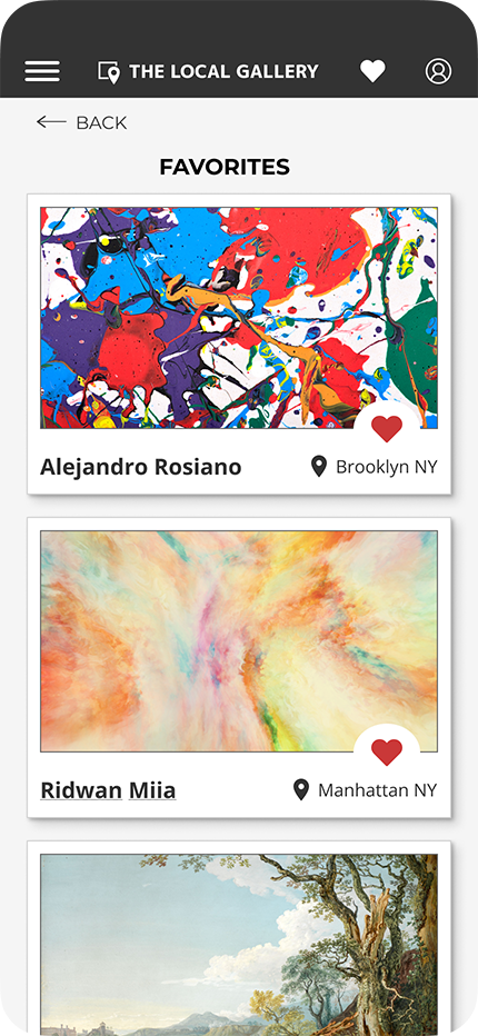
- Users need ways to save and revisit artists and artwork
- Artist information should support familiarity, not just identification
Iteration (Version 1)
Initial Design Direction
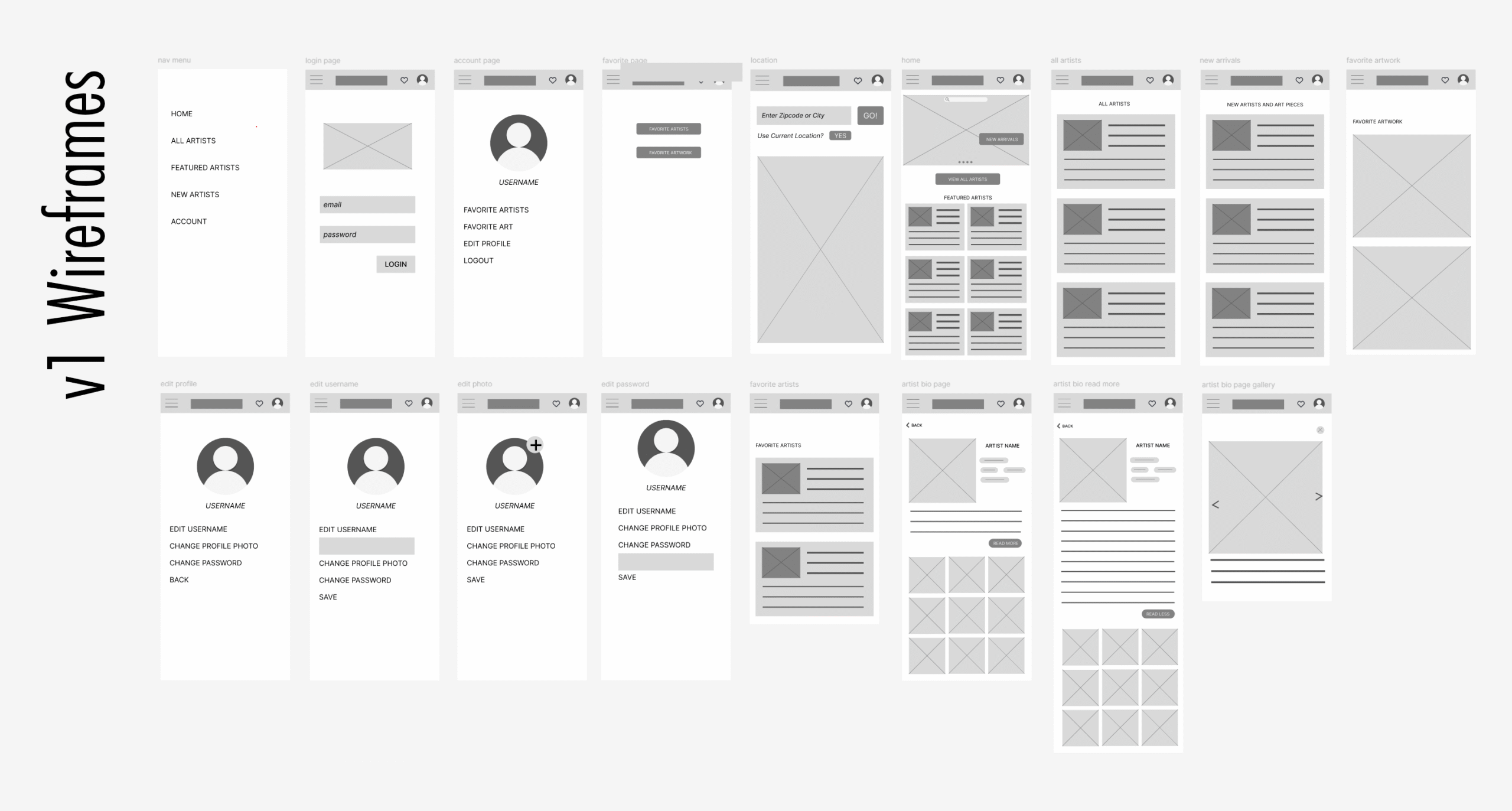
Based on early research, the first iteration focused on helping users become familiar with local artists, not just their work. Many existing platforms reduced artists to a name and a short blurb, making discovery feel shallow and easy to forget.
Version 1 responded to this gap by emphasizing detailed artist profiles at the point of discovery. Artist cards surfaced the individual first, supported by text-based information intended to communicate personality, background, and artistic approach. The goal was to make artists feel recognizable and human, rather than interchangeable entries in a feed.
Design Rationale
This direction was intentional. Research indicated that users wanted context and continuity, not just one-off encounters with artwork. Version 1 treated discovery as a learning process, assuming that deeper information would help users decide which artists were worth exploring further.
At this stage, the design prioritized familiarity over visual browsing, testing whether information-first discovery could support stronger connection.
USABILITY TESTING — VERSION 1
Testing Goals
Usability testing for Version 1 focused on how users evaluated artists during discovery. The primary question was whether emphasizing detailed artist information early in the experience helped users decide who they wanted to explore further.
Rather than testing navigation or task completion, sessions centered on how users interpreted discovery cards and what signals they relied on when deciding whether to tap into an artist profile.
What Testing Revealed
Initial reactions to Version 1 were positive. Participants described the app as clear and approachable, and many responded well to the idea of learning about artists as people rather than anonymous profiles.
However, deeper discussion surfaced a key issue. While users appreciated the amount of information available, they felt uncertain about how to decide who to click on. Discovery cards relied heavily on text and small images, making it difficult to quickly assess whether they liked the artwork itself.
Several participants noted that they were being asked to make a decision before seeing enough of the work. As a result, choosing an artist often felt like a guess rather than an intuitive choice.
Key Insight
Users wanted to see the work first.
They were comfortable learning about the artist, but only after forming an initial visual connection. When artwork was harder to see at the discovery level, decision-making felt slower and less intuitive.
This insight challenged the assumption that more information upfront would lead to better discovery, and it directly informed the next design iteration.
Iteration (Version 2)
Design Shift
Usability testing made one thing clear: discovery needed to begin with the artwork itself. While users valued learning about artists, they wanted to form a visual connection before engaging with detailed information.
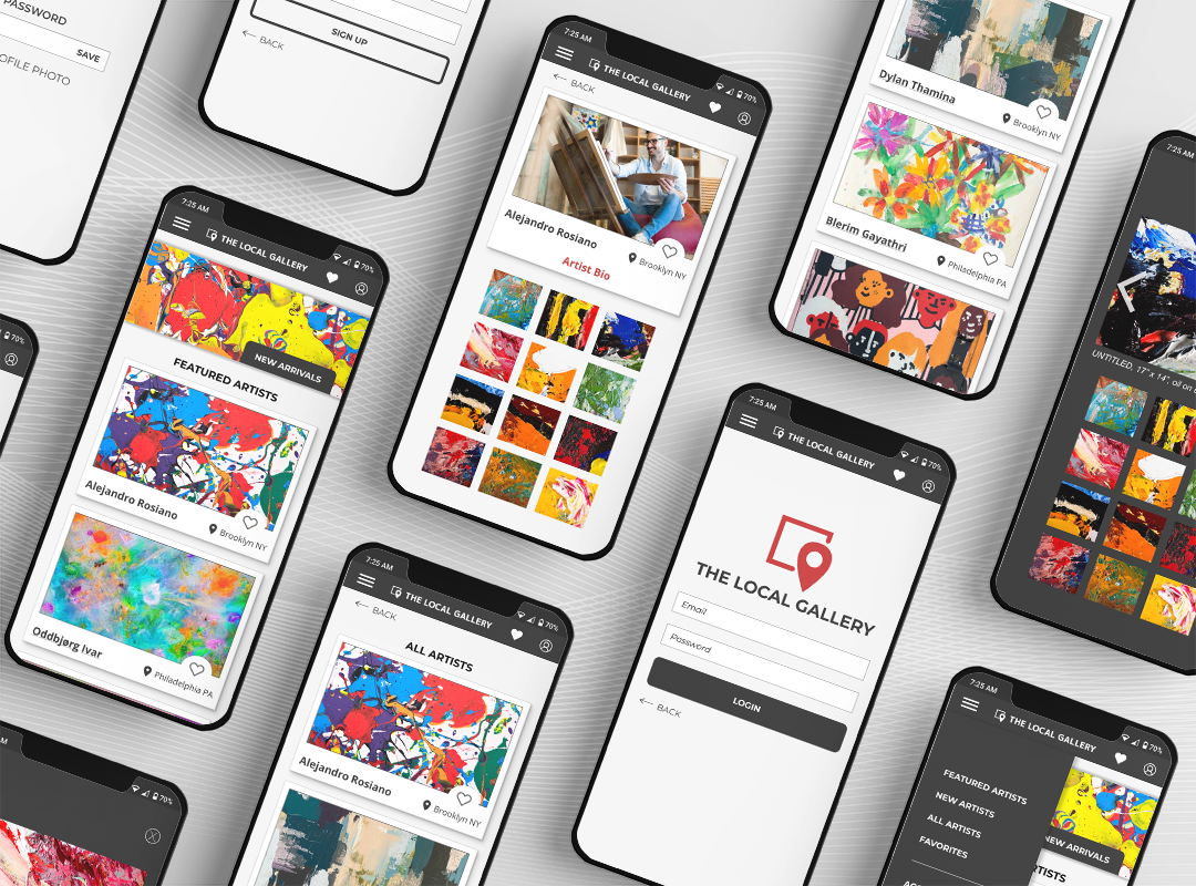
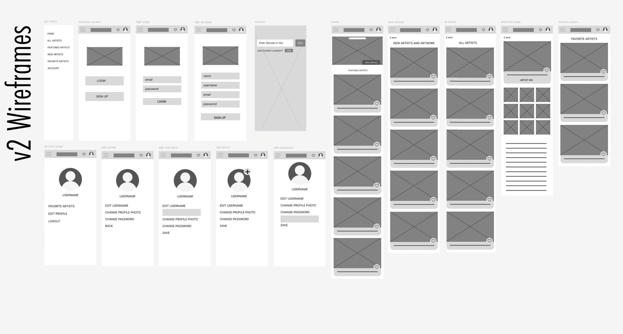
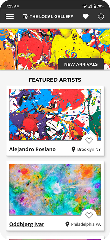
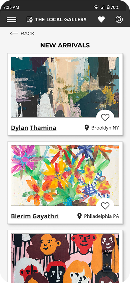
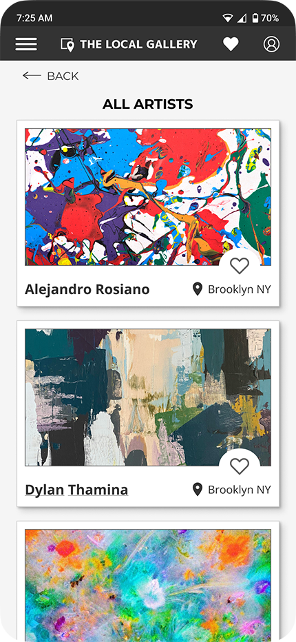
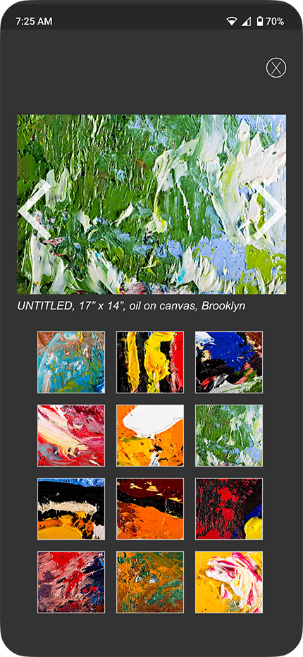
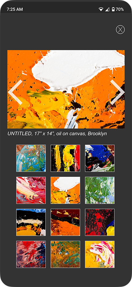
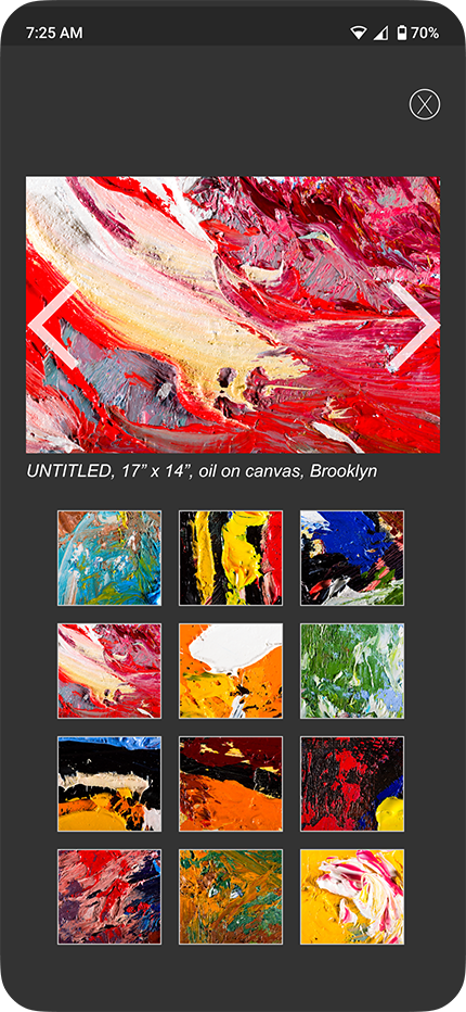
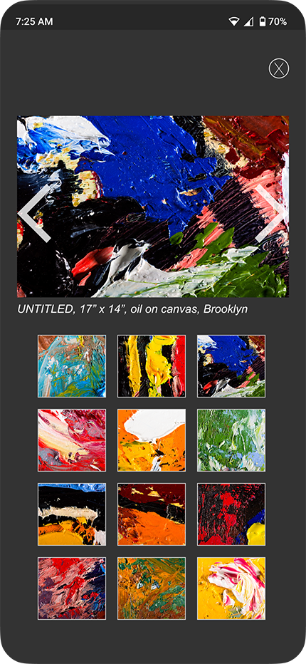
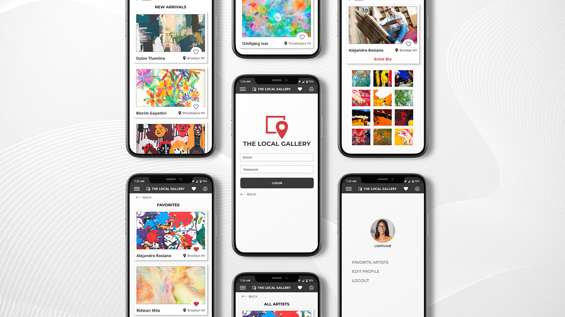
Version 2 reframed discovery as a visual decision first. Artist cards were redesigned to prioritize full artwork images with minimal text, allowing users to scan quickly, compare intuitively, and follow their instincts while browsing.
Updated Discovery Experience
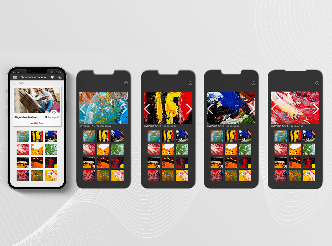
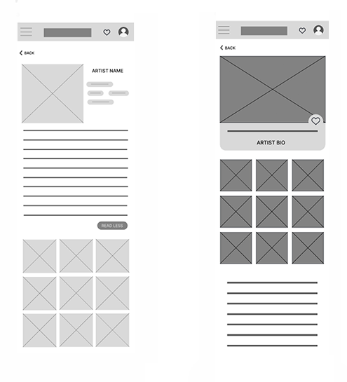
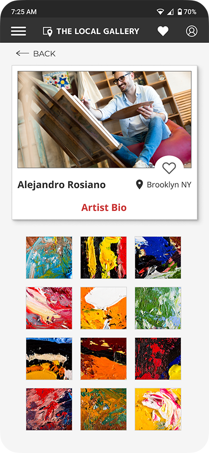
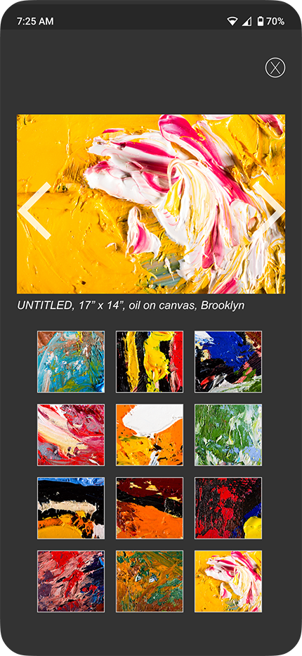
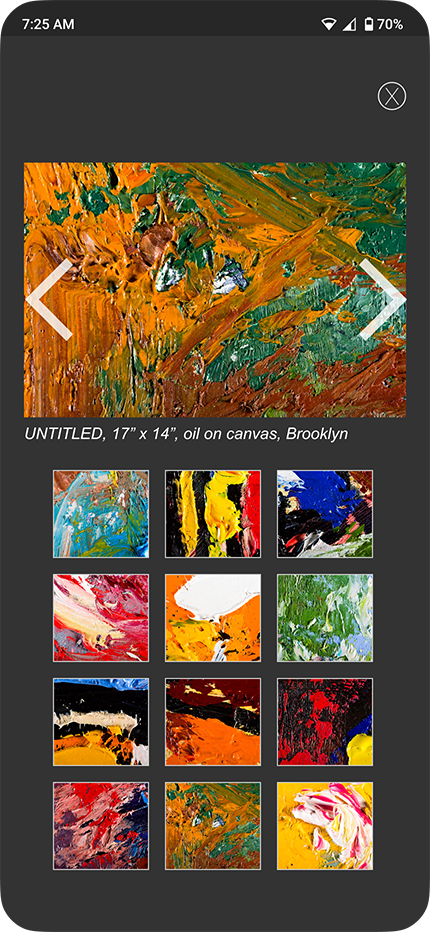
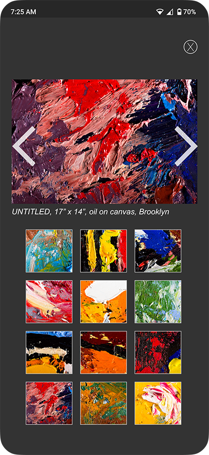
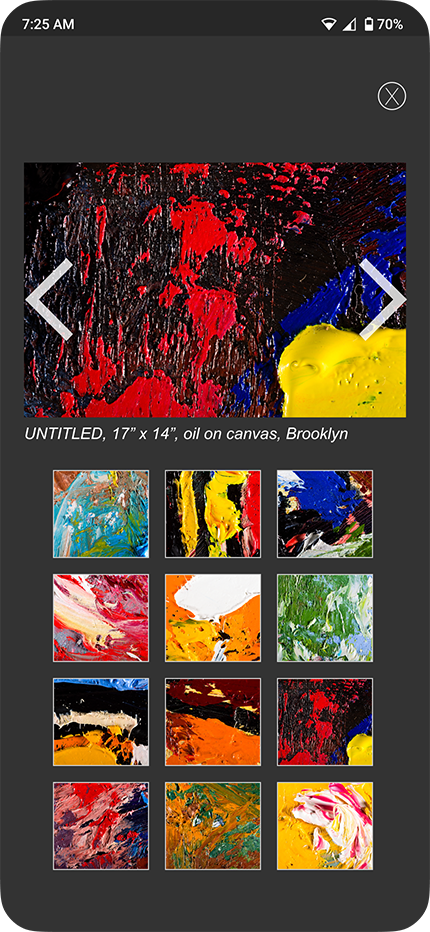
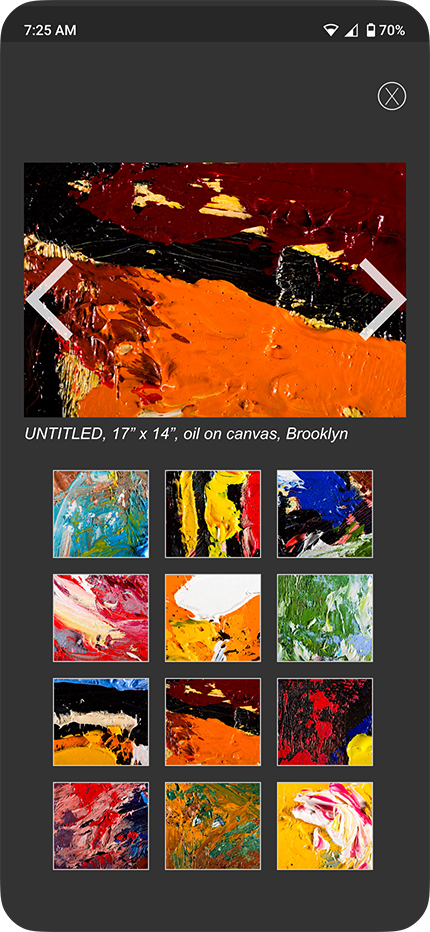
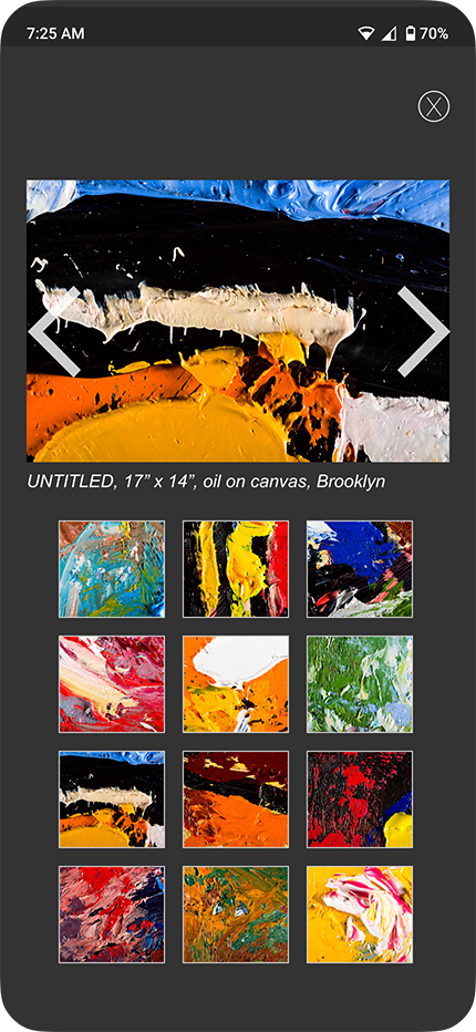
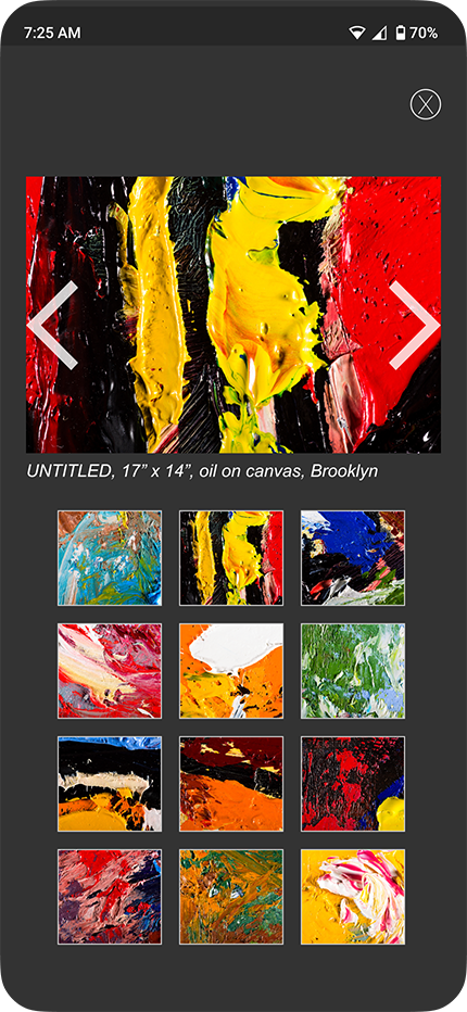
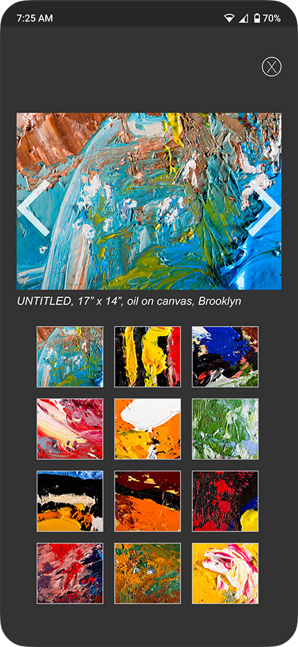
In the updated experience, tapping into an artist reveals a dedicated profile where artwork takes visual priority. Multiple pieces are presented immediately, supporting comparison and deeper exploration before introducing written context.
Artist information remains an important part of the experience, but it is intentionally positioned after visual interest is established. This sequencing aligns with how users naturally evaluate art while preserving the original goal of helping users become familiar with artists over time.
What Stayed the Same
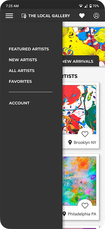
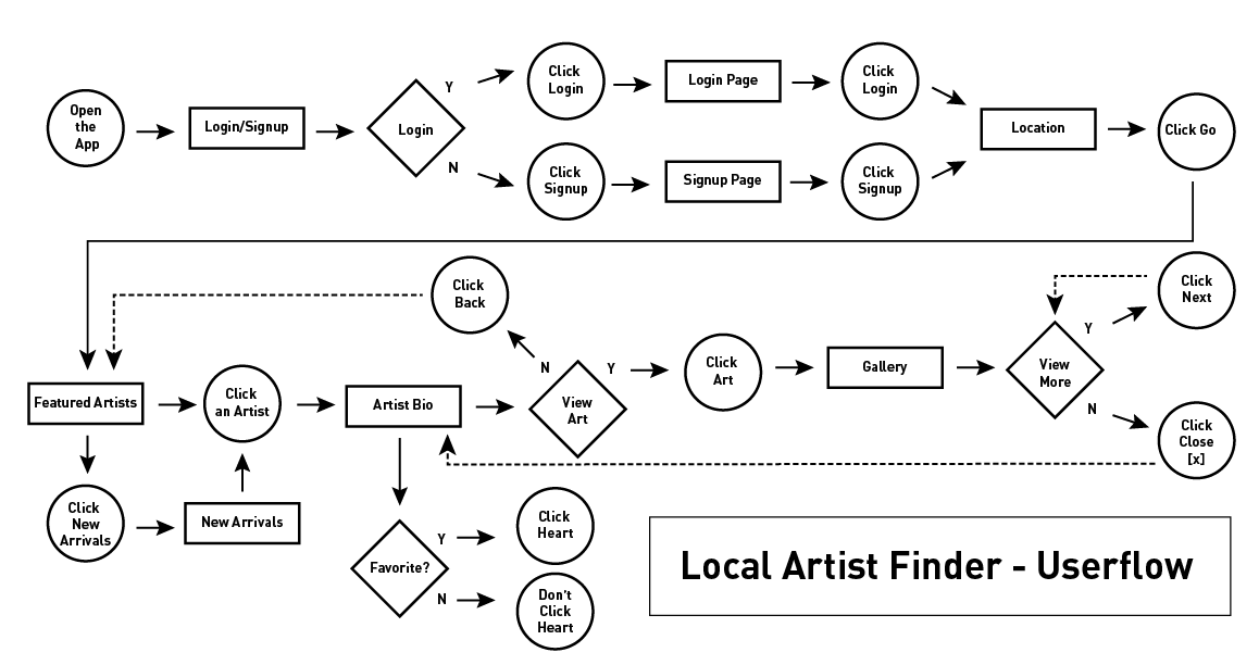
The core user flow remained consistent across iterations. Location-based discovery, favoriting, and primary navigation did not change. The iteration focused on how information was presented, not where users could go.
This allowed meaningful improvements without introducing additional complexity or requiring users to relearn the experience.
Final Design
Final Experience
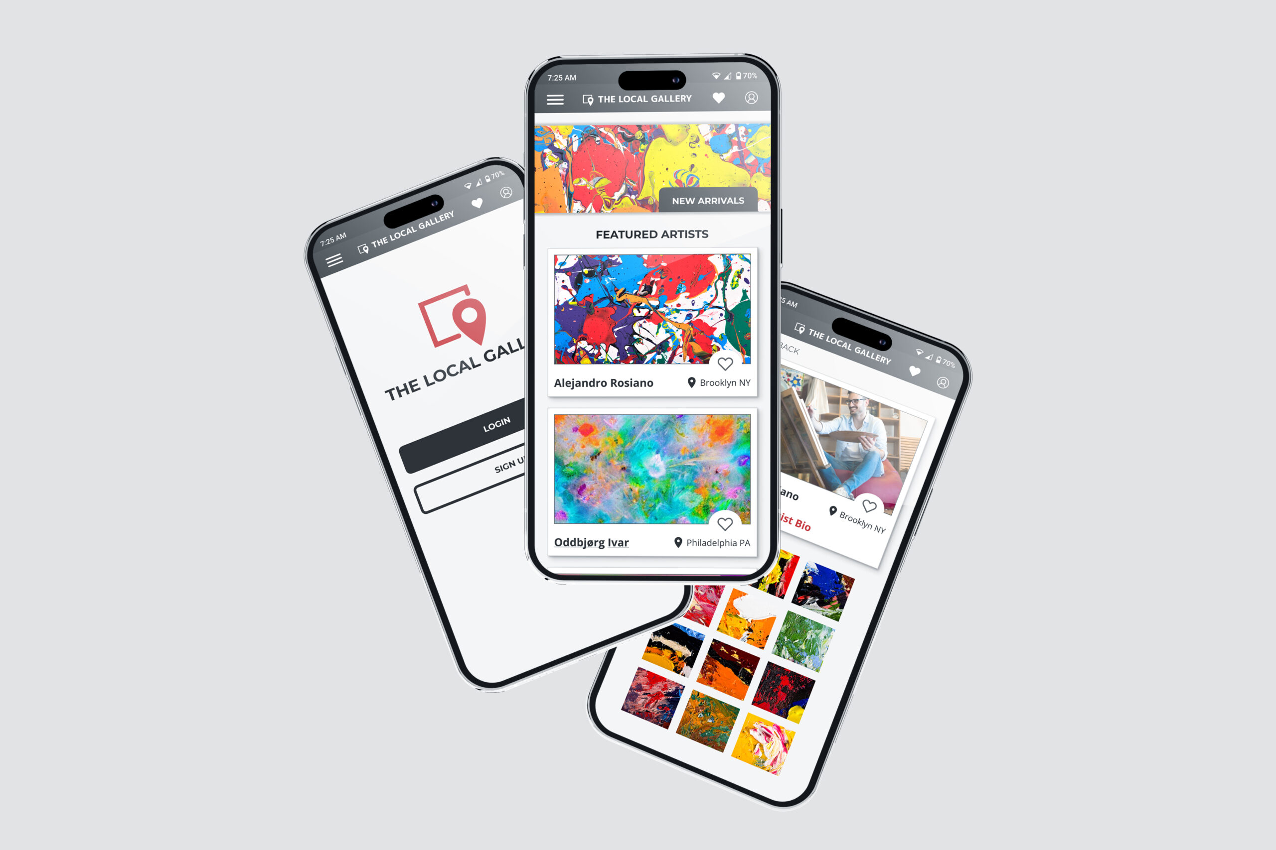
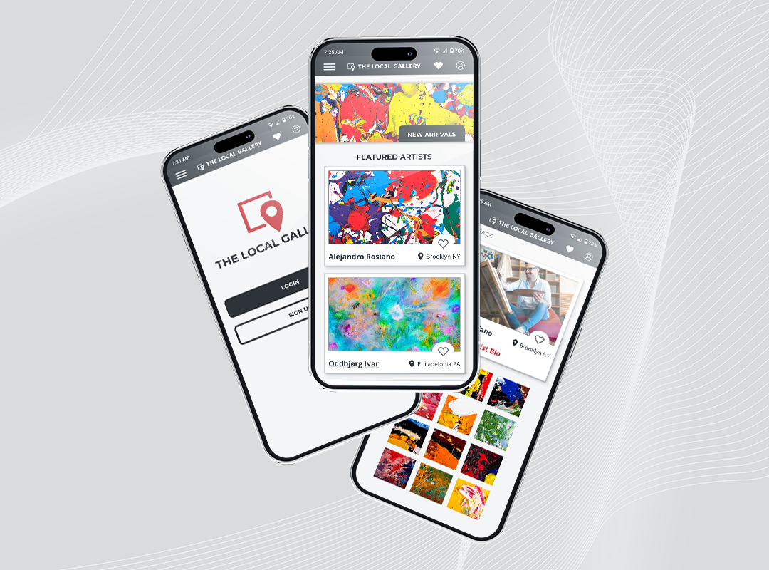
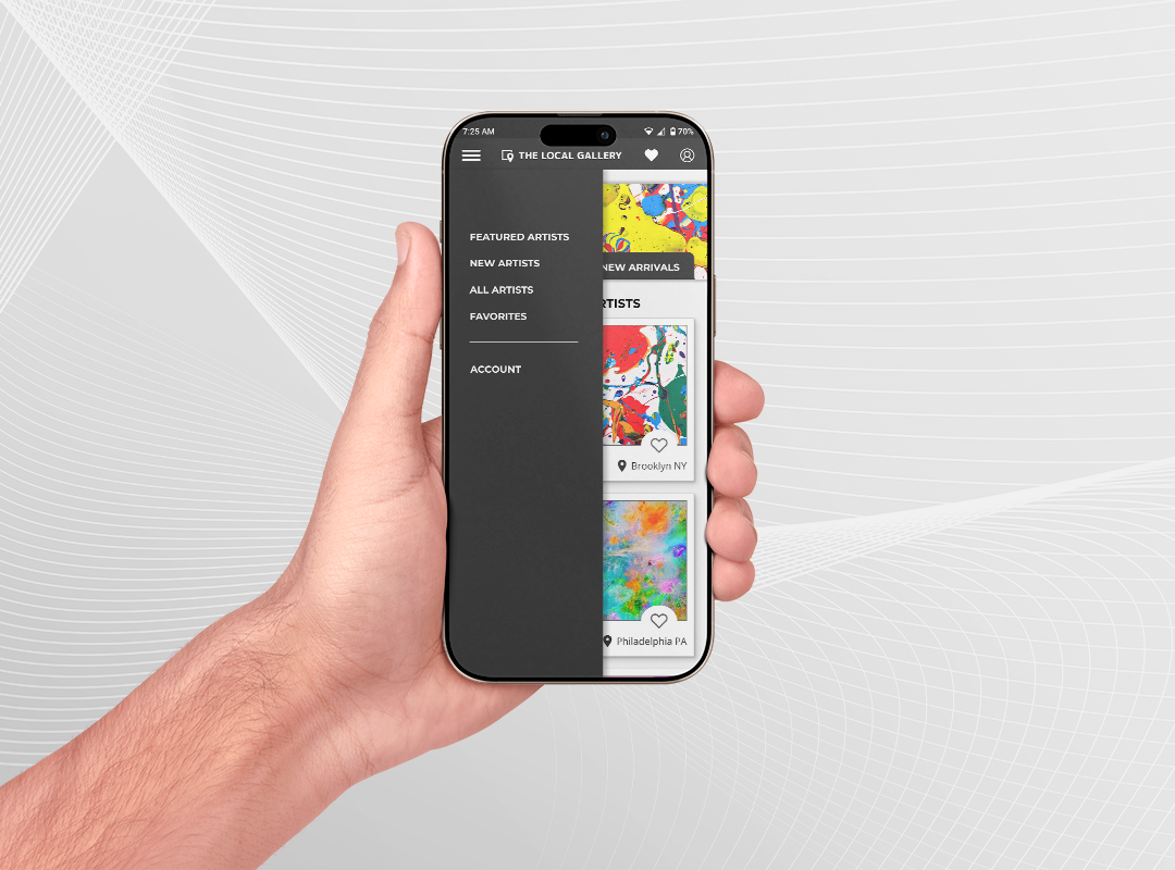
The final design delivers a visual-first discovery experience centered on local artists and their work. Artwork leads the experience, allowing users to browse intuitively and form quick impressions before choosing to explore further.
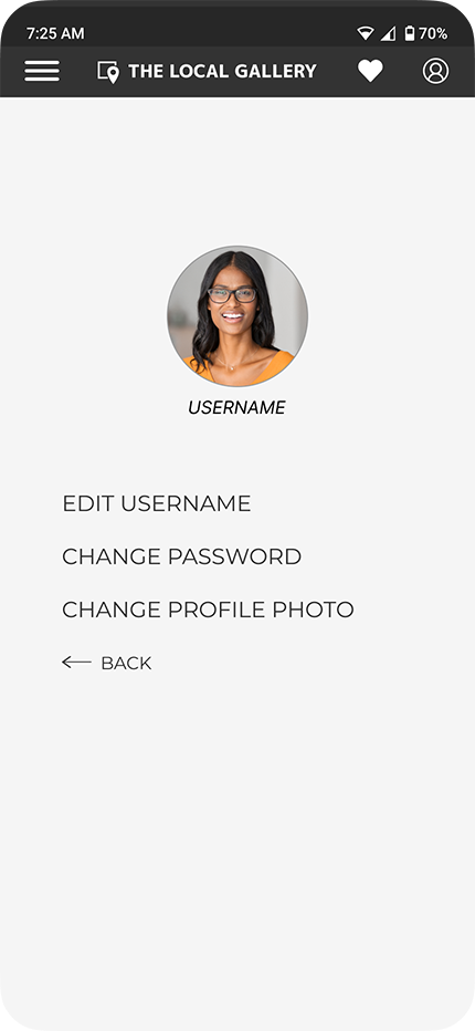
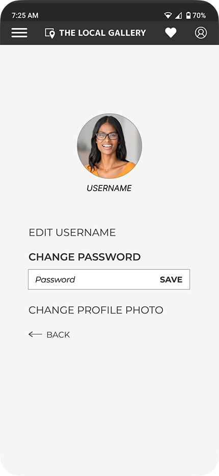
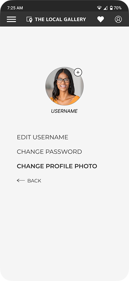
From the Featured view, users can scan artwork from nearby artists, tap into artist profiles, and move fluidly between individual pieces. Once interest is established, detailed artist information becomes available, supporting familiarity without slowing down discovery.
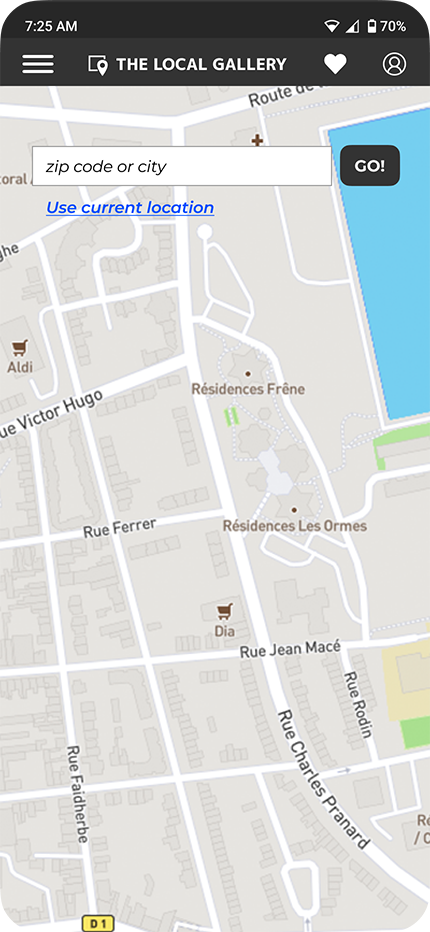
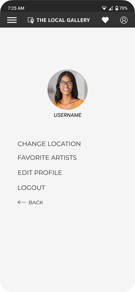
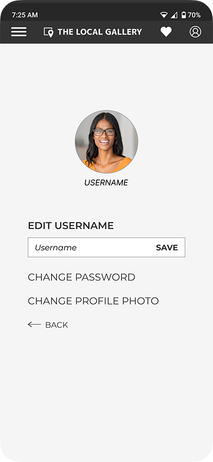
Location-based filtering and favoriting remain core to the experience, reinforcing the original goal of helping users find and stay connected to artists in their area.
Design Principles Reflected
The final interface reflects three key principles established through research and testing:
Low friction exploration
Browsing, saving, and returning to artists feels lightweight and intuitive.
Visual clarity
Artwork is given priority at every stage of discovery.
Progressive disclosure
Information is revealed when it becomes relevant, not all at once.
Outcome
- Visual-first discovery reduced hesitation
- Users felt more confident choosing artists
- Core flow remained simple and intuitive
Key Learnings
- Seeing artwork drives decisions
- Timing matters more than volume
- Testing requires follow-up questions
Next Steps
- Enable light social interaction
- Follow artists and friends
- Surface new work activity
