
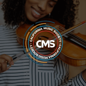
California Music Society
An identity system for a nonprofit music organization rooted in community and education.
Role: Research and design — brand identity, logo system, color palette, and visual applications
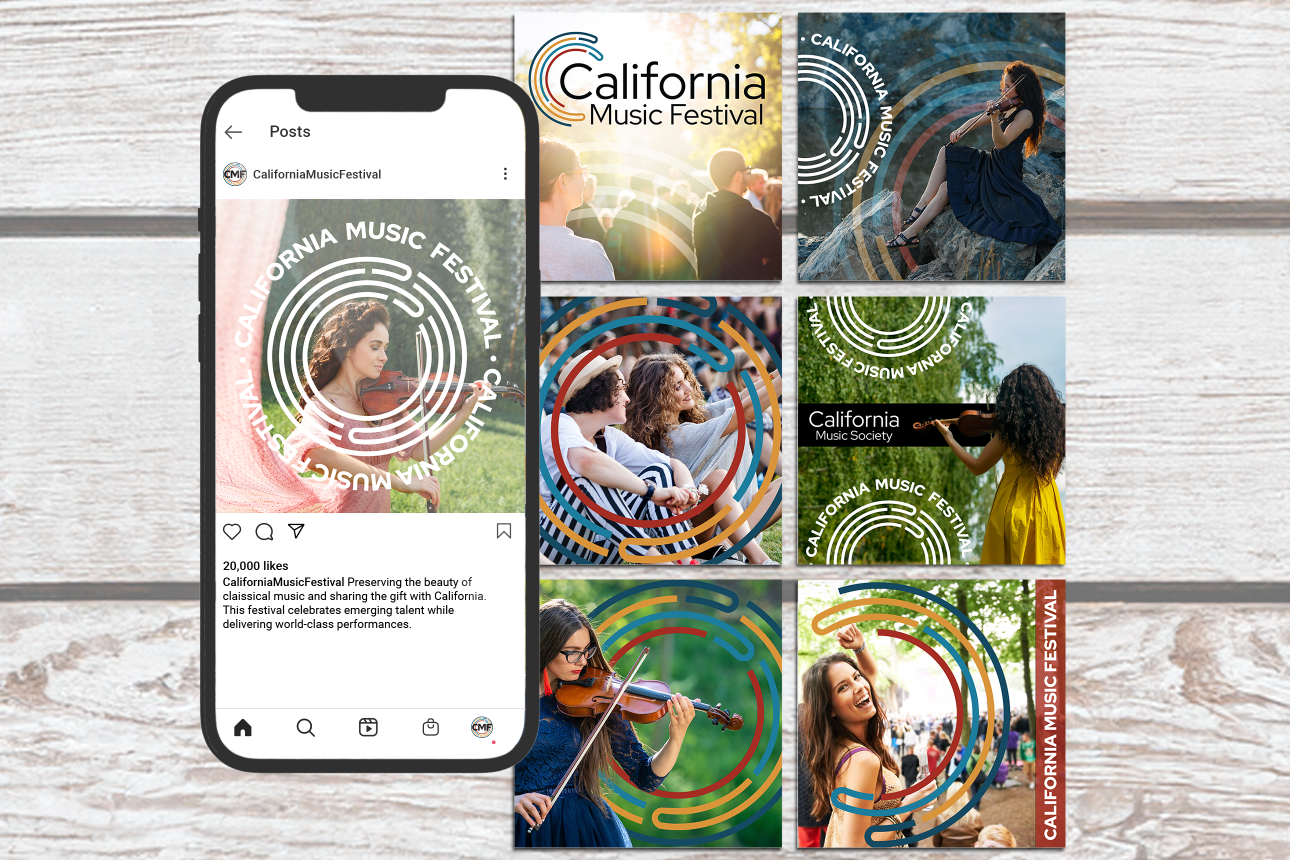
The California Music Society branding project focused on developing a cohesive visual identity for a nonprofit music organization and its affiliated festival. The work included the creation of a primary identity for California Music Society and a related mark for the California Music Festival, designed to function as part of a shared system. The goal was to establish a visual language that felt rooted in musical tradition while remaining flexible enough to support both the organization and its festival without introducing separate or competing identities.
The Challenge
California Music Society was seeking a rebrand that could imply music without relying on the generic symbols commonly used by music nonprofits. While the organization had already moved away from obvious visual tropes, the existing identity lacked the clarity, flexibility, and cohesion needed to function as a long-term brand system. The challenge was to refine and strengthen the identity so it felt distinctly musical while remaining abstract enough to stand apart from similar organizations.
In parallel, the California Music Festival required a visual identity of its own. The challenge was not only to design a festival brand, but to extend the Society’s identity in a way that created a clear relationship between the two — connected, but not identical. This required a system capable of unifying multiple expressions while allowing each to maintain its own presence.
Design Direction
The design direction focused on abstraction rather than literal representation, using form, rhythm, and balance to imply music without relying on familiar visual shortcuts. Inspiration from the orchestra pit informed the structure of the mark, but the goal was not depiction — it was suggestion. This allowed the identity to feel musical without becoming illustrative or obvious.
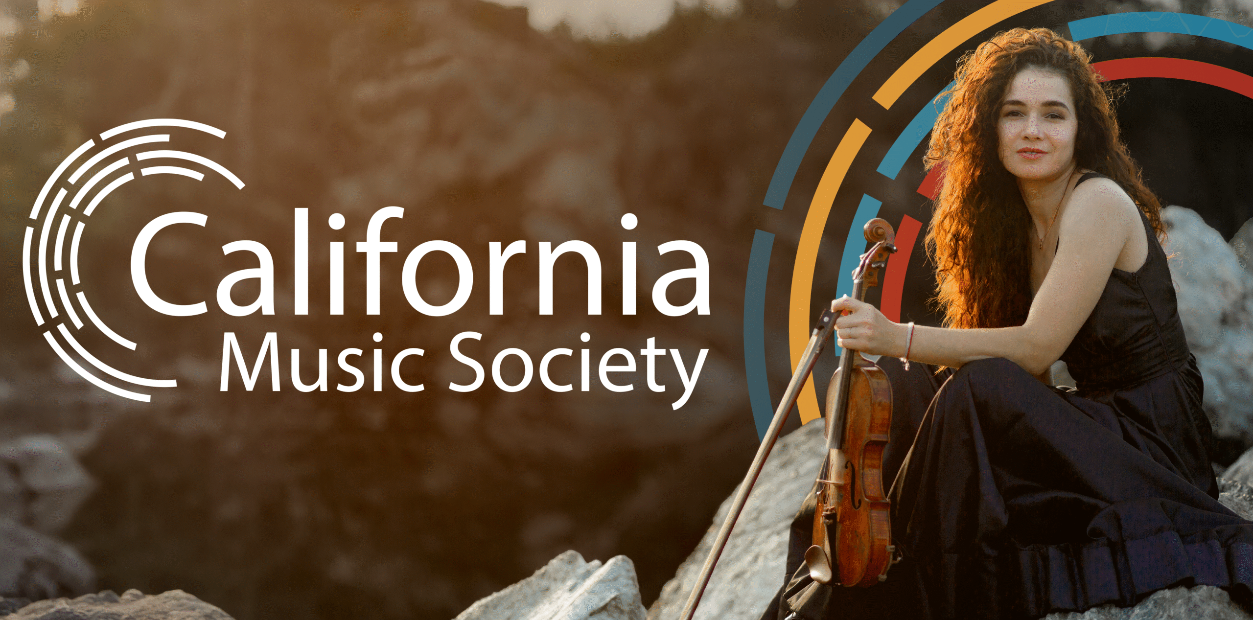
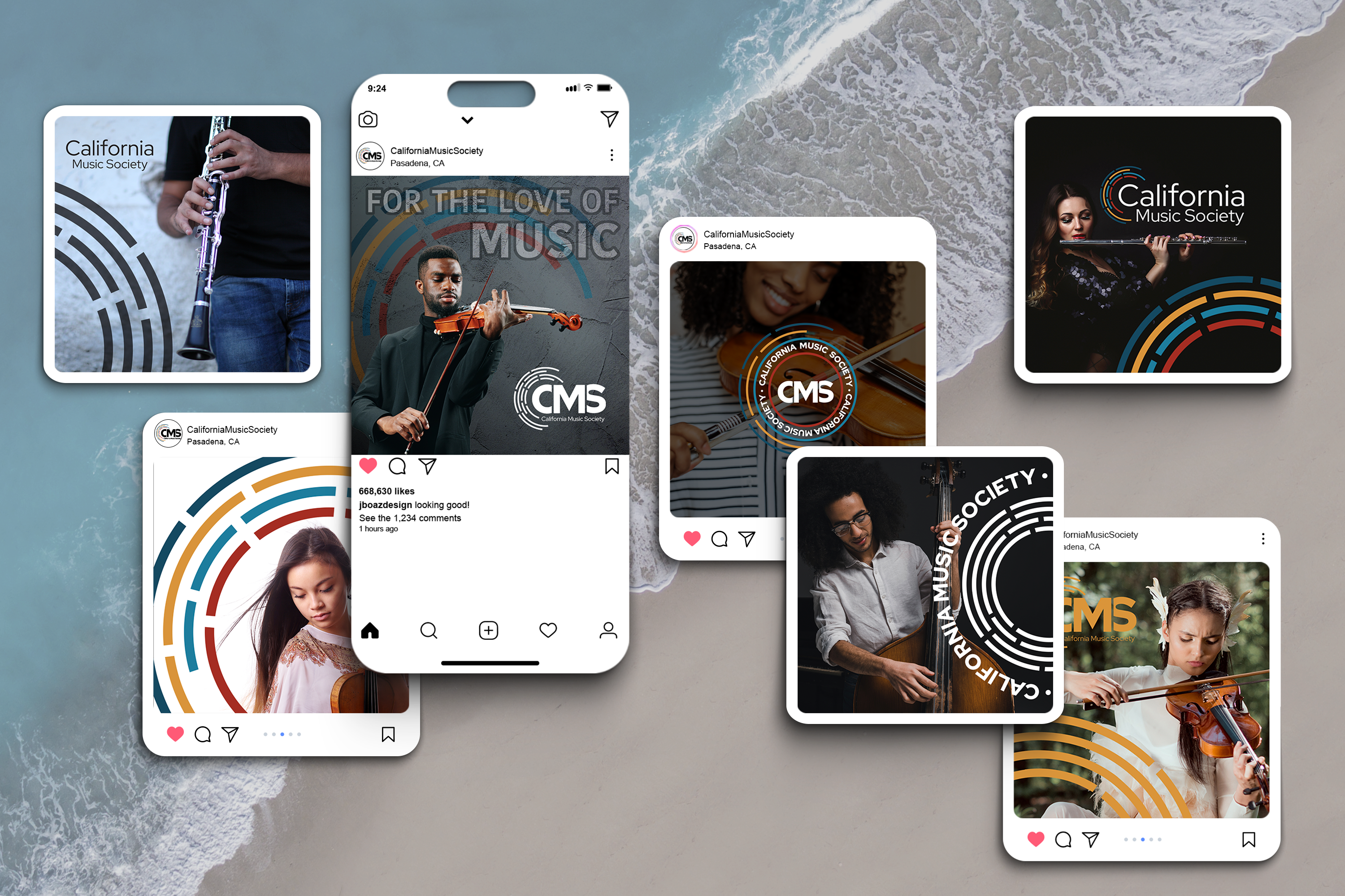
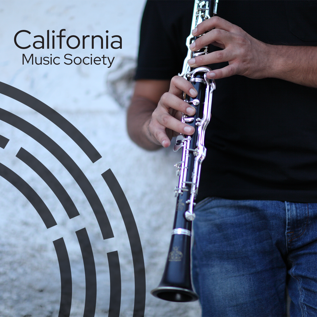
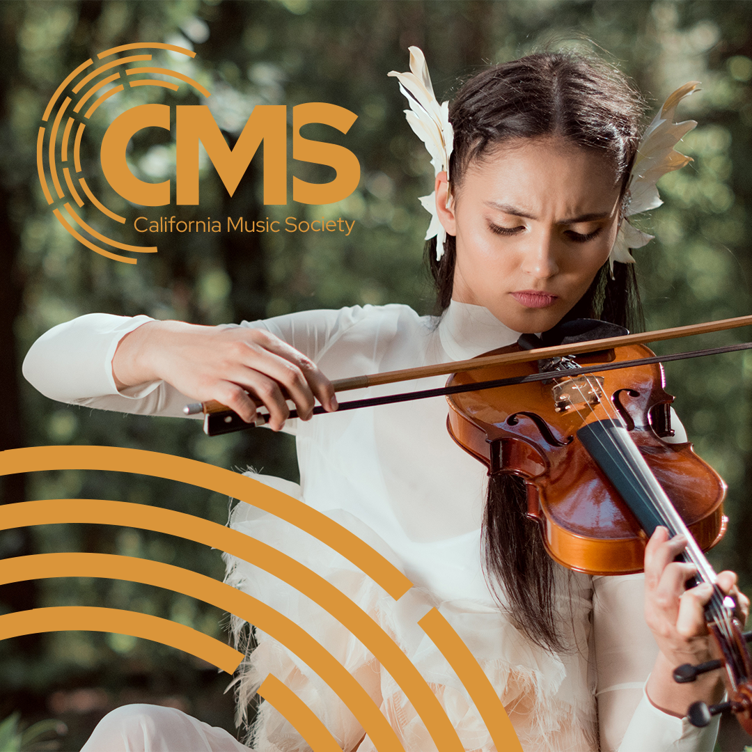
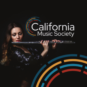
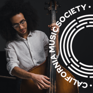
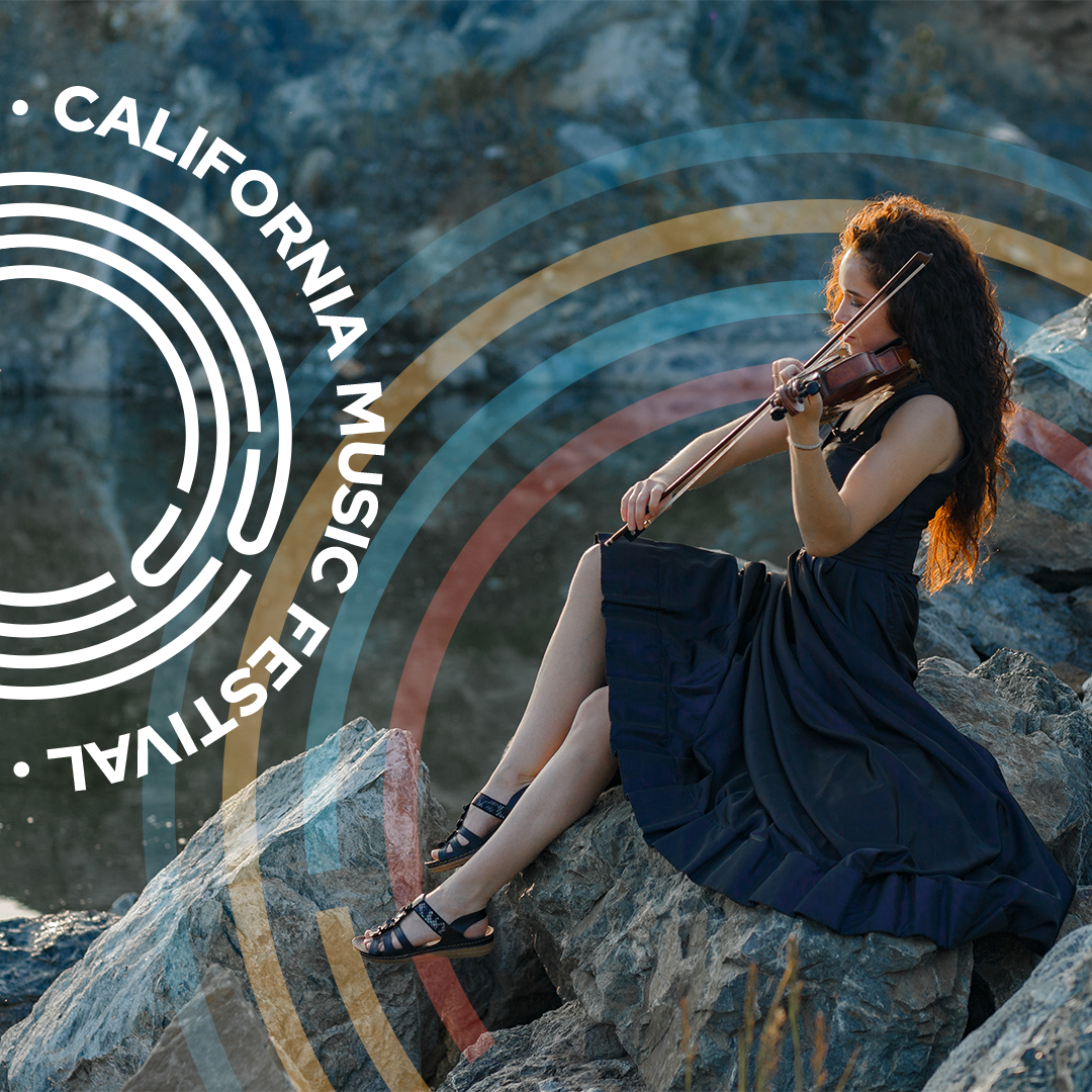
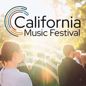
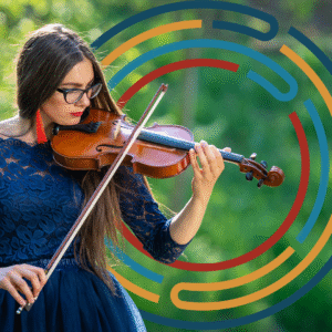
California poppy red was established as a key color to ground the system and provide a strong, recognizable anchor. From there, the identity was developed as a flexible suite of marks capable of adapting across contexts, creating a visual relationship between California Music Society and the California Music Festival while allowing each to retain its own character.


Identity System
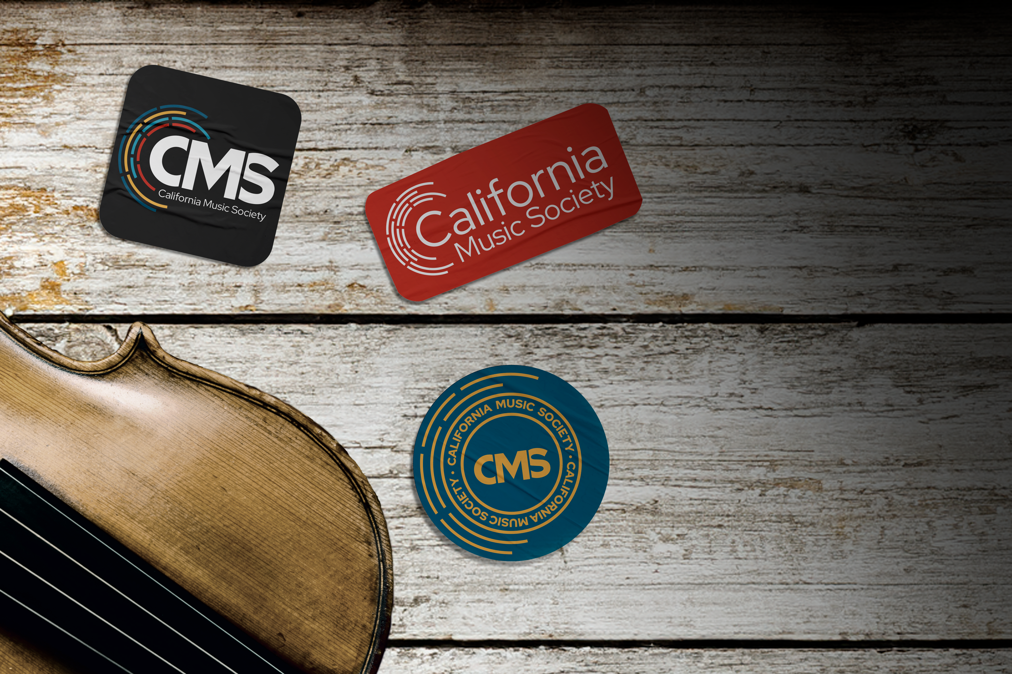
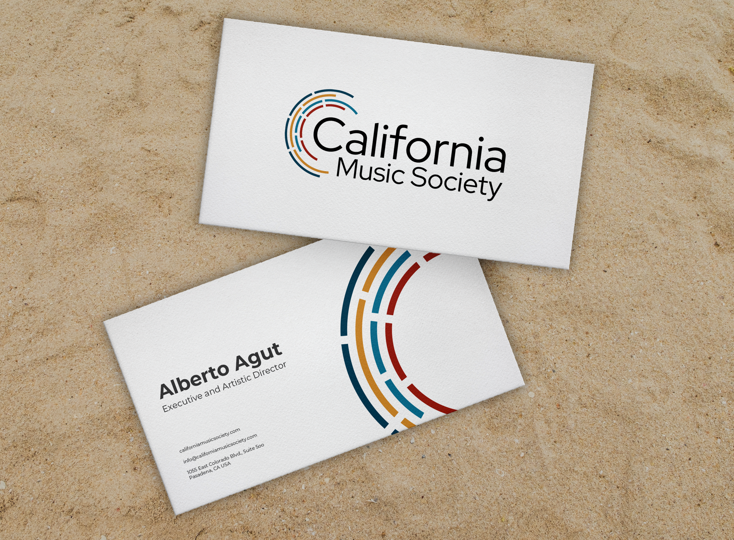
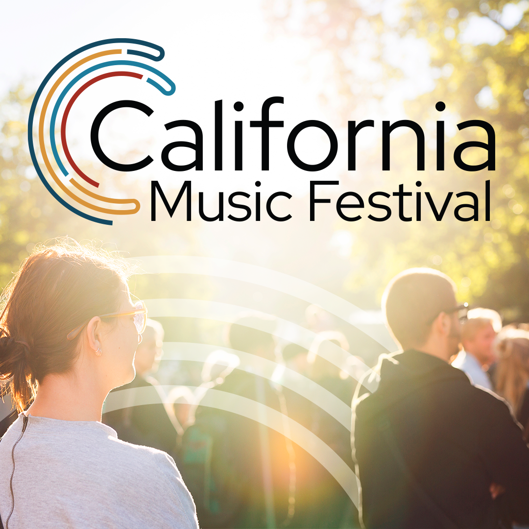
Main Logo
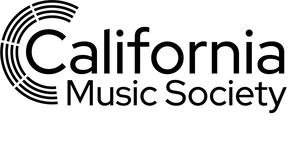
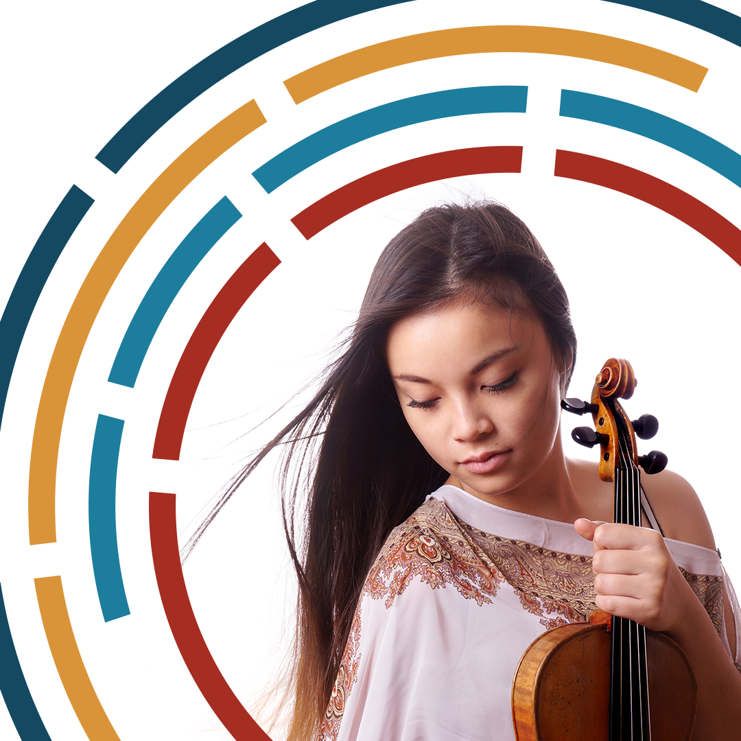
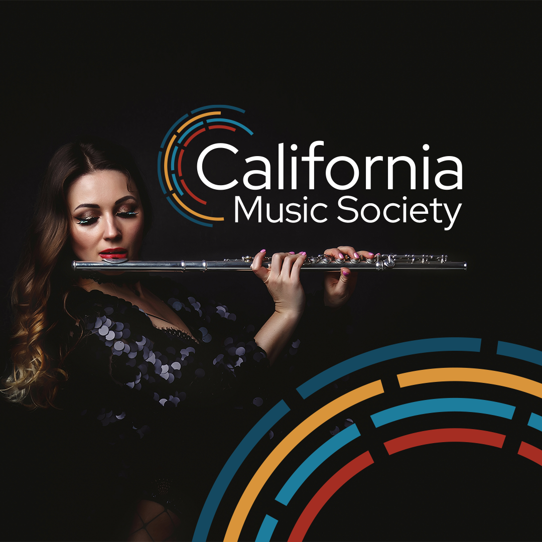
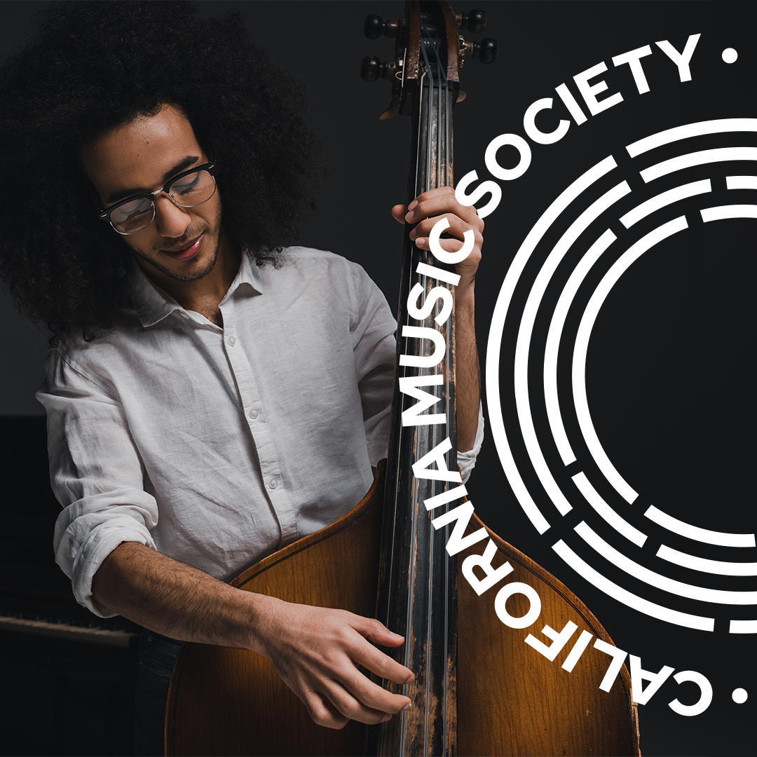
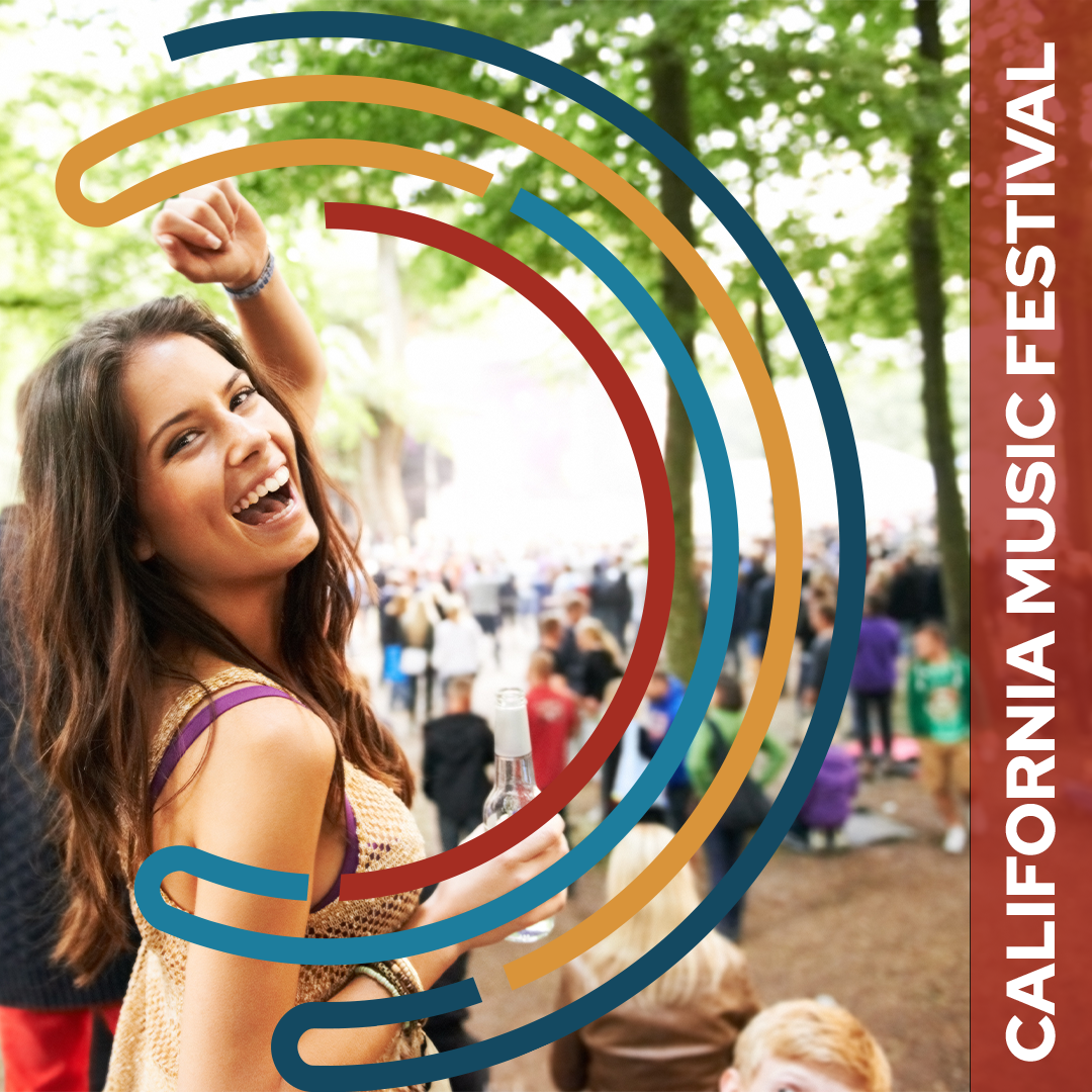
The primary mark is built from interrupted, curved lines of varying lengths, arranged in an asymmetrical structure. The form suggests a half-circle without fully resolving into one, creating a sense of movement and balance rather than a fixed shape.
This approach allows the logo to reference the idea of an orchestra pit without literal depiction. The offset lines imply individuals moving together toward cohesion, reflecting the collaborative nature of learning and performance across different skill levels.


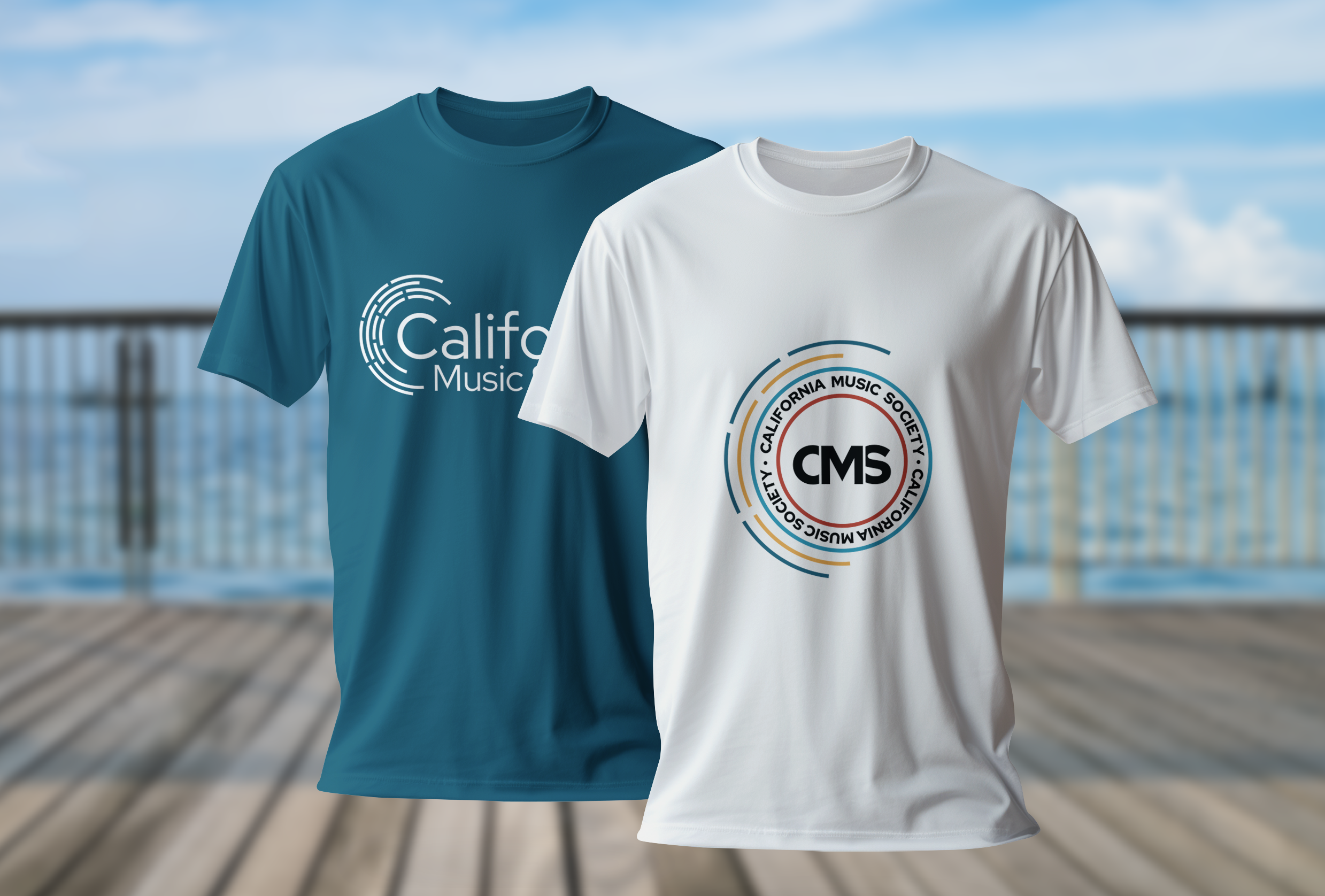
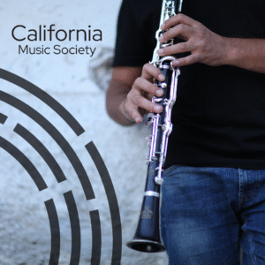
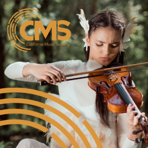
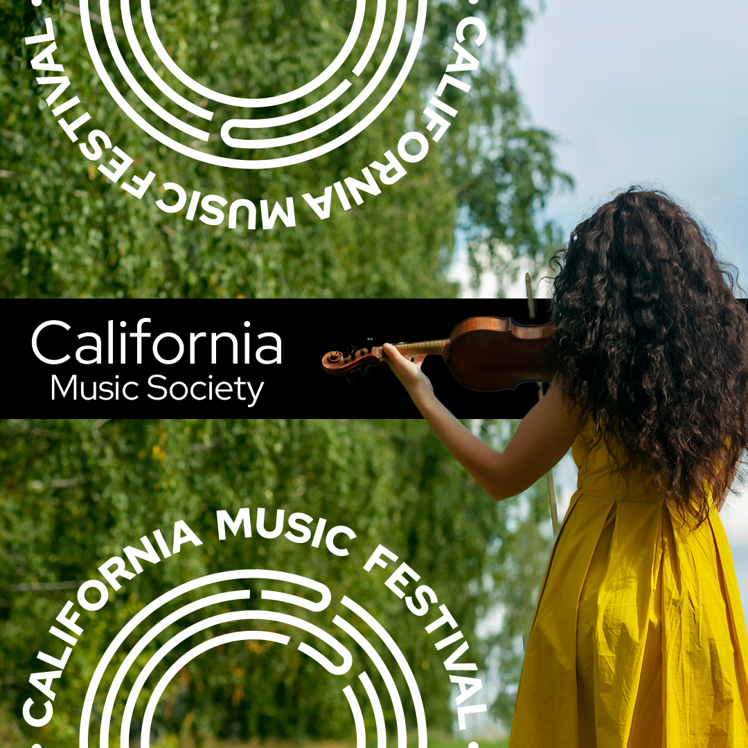
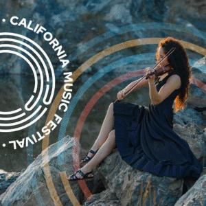
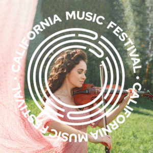
Logo Suite
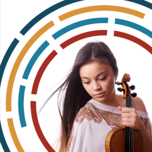
The identity was developed as a flexible suite of marks derived from the same visual language. Variations allow the system to adapt across formats and applications while maintaining consistency and recognizability.
Color Palette
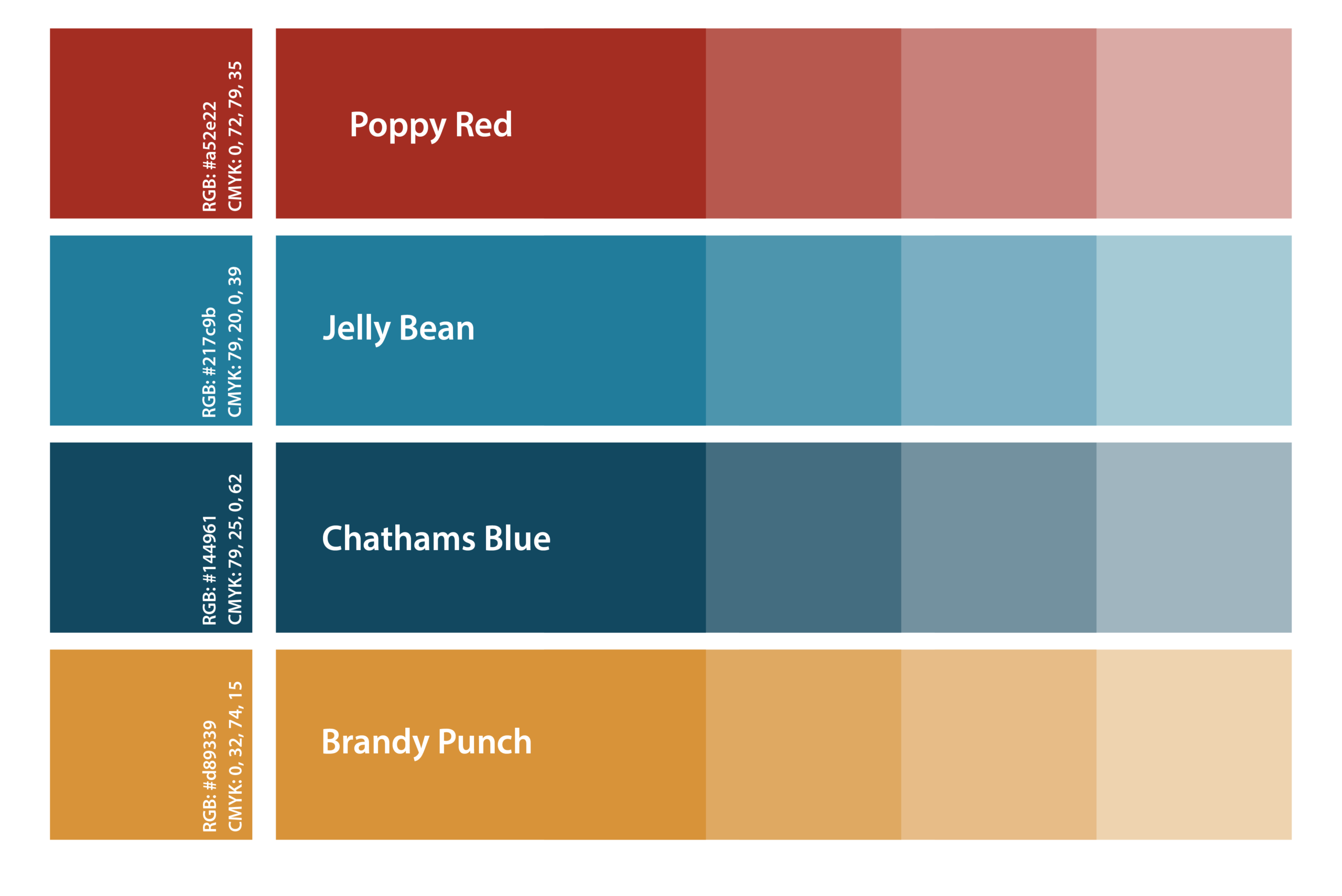
California poppy red was established as the primary signature color, grounding the identity in a clear sense of place while providing a strong, recognizable anchor. Its depth and saturation allow it to feel confident and expressive without becoming decorative, making it suitable for both institutional and promotional use.
The supporting palette was built to complement the red without competing with it. A warm golden yellow introduces brightness and energy, adding warmth and approachability while remaining rich enough to avoid feeling playful or informal. Two blues, a deep muted navy and a more saturated mid-blue, provide contrast and stability. Together, they balance the warmth of the red and yellow, creating a palette that feels structured, versatile, and cohesive across a range of applications.
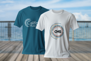
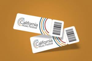
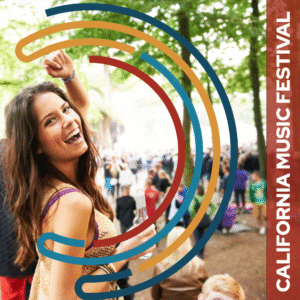
Festival Identity
The California Music Festival identity was developed as a direct extension of the California Music Society system. Rather than creating a separate visual language, the festival mark draws from the same forms, structure, and palette, establishing a clear relationship between the two while allowing the festival to feel distinct in tone and application.
The festival identity uses the same abstract approach to imply music without literal symbols, reinforcing continuity across the organization’s branding. Differences in scale, composition, and emphasis allow the Festival to signal a more public-facing and celebratory context while remaining visually anchored to the Society.


Outcome and Learnings
Building the identity as a flexible system from the outset allowed it to adapt across formats and applications without losing clarity or consistency.
A cohesive identity system was created that successfully unified California Music Society and the California Music Festival while allowing each to maintain a distinct presence.
Designing through abstraction proved effective in implying music and collaboration without relying on common visual tropes used by similar organizations.