California Music Society
Client
California Music Society – Rebrand: Logo Suite and Brand Colors
My Role
Researcher and Designer. Deliverables: Logo suite, brand colors, social media graphics
Design Problem
Client wanted a logo that showed an orchestra of various levels of talent coming together to learn and teach. They wanted a logo for their society and their music festival that imply the relationship between them, but each have their own identity.
The Solution
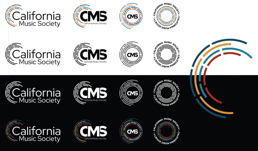
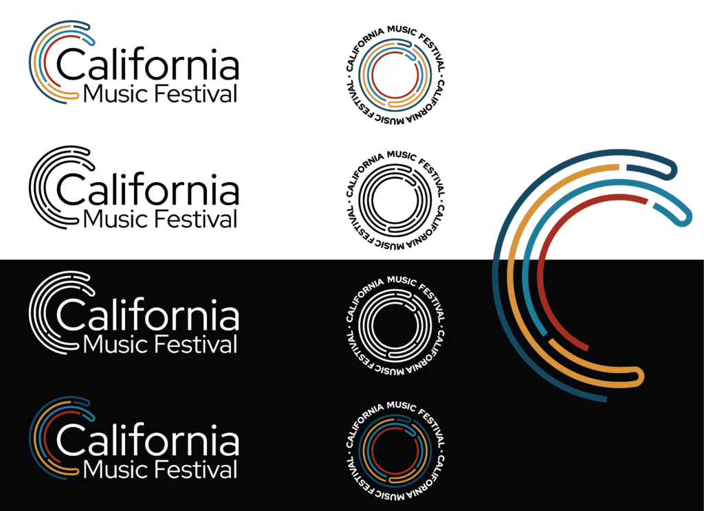
Two logo suites using the same colors and general concept, but using different logomarks. A logo that is both symbolic of an orchestra pit and conveys the feel of California through color. A logo for the festival that takes the same concept but change the logomark to flow more casually.
Process
Main Logo
After the experiments above I came up with an idea that incorporates the original concept but leaves room for creativity.
interrupted curved lines | different lengths of lines | asymmetrically stacked
This design still hints at the idea of a half circle, but a little scattered and off center. The lines are in movement trying to find equilibrium. This brings to mind the idea of people of various skill levels learning together and finding balance. I imagine the group working together to find the shape of an orchestra pit.
Logo Design – CMF
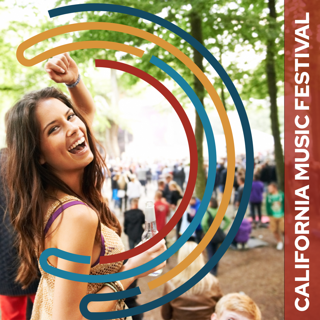
The client was in need of a second logo that could be used for their music festival, California Music Festival. I used the same logo but edited the logomark. Since the lines lead into one another, it gives the impression of music and celebration which is representative of a festival. I created one variation of the logo, an emblem.
Color Palette
I spent a lot of time working with the color palette. The client wanted to use “poppy red” as it is representative of California. Starting with that color as my base I added complimentary colors. I settled on the first one, but after working with it, I reaelized it didn’t have the professionalism I was looking for. The second palette was much better, but it still felt too bright. I landed on the final palette because the hues are more professional and the desaturation feels more serious. The society is orchestral and focuses on classical music. I felt the color palette should represent that.

Results
Mockups
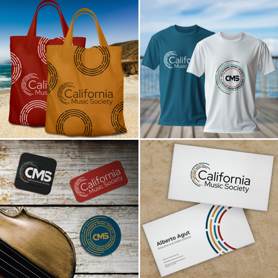
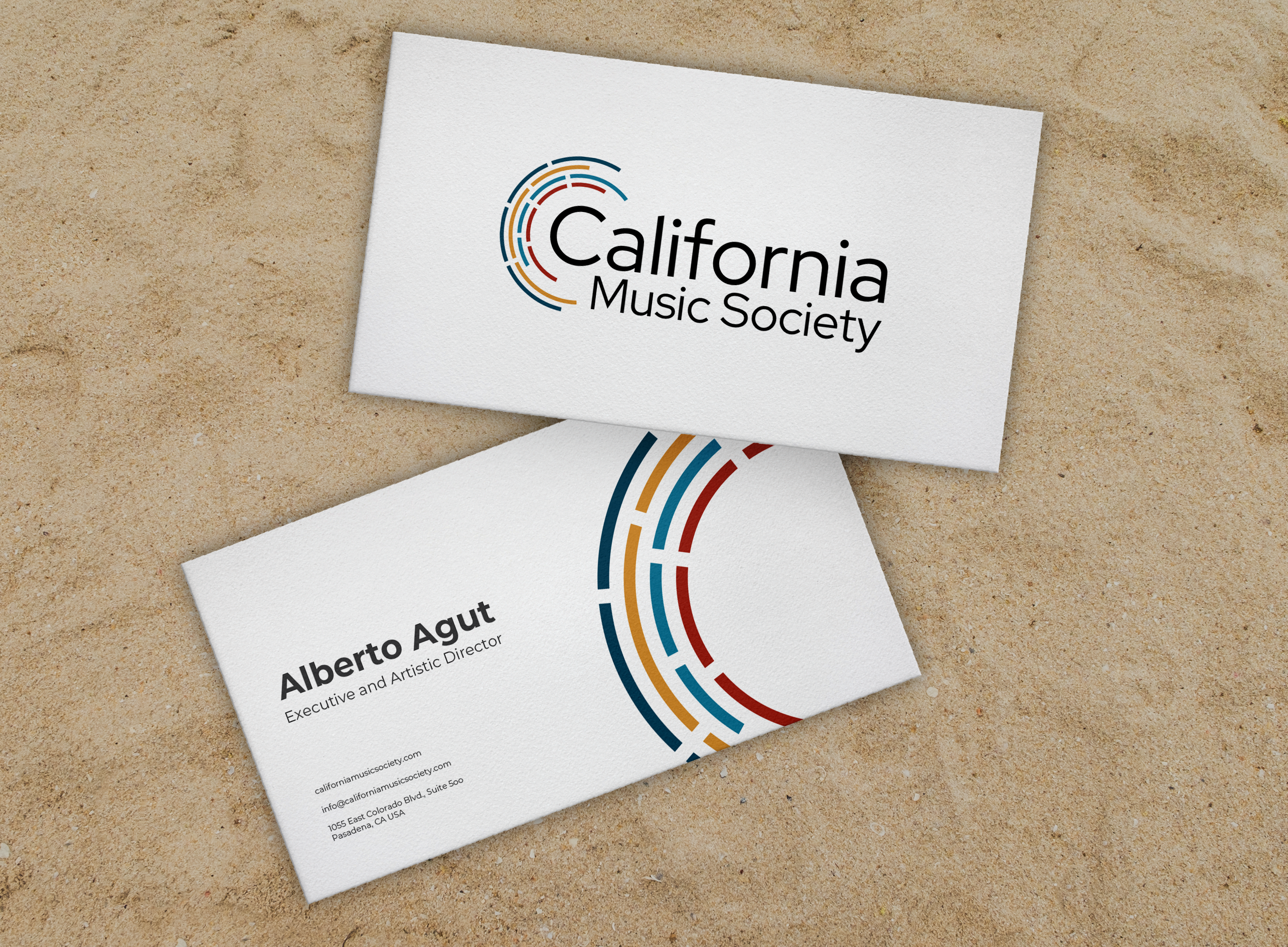
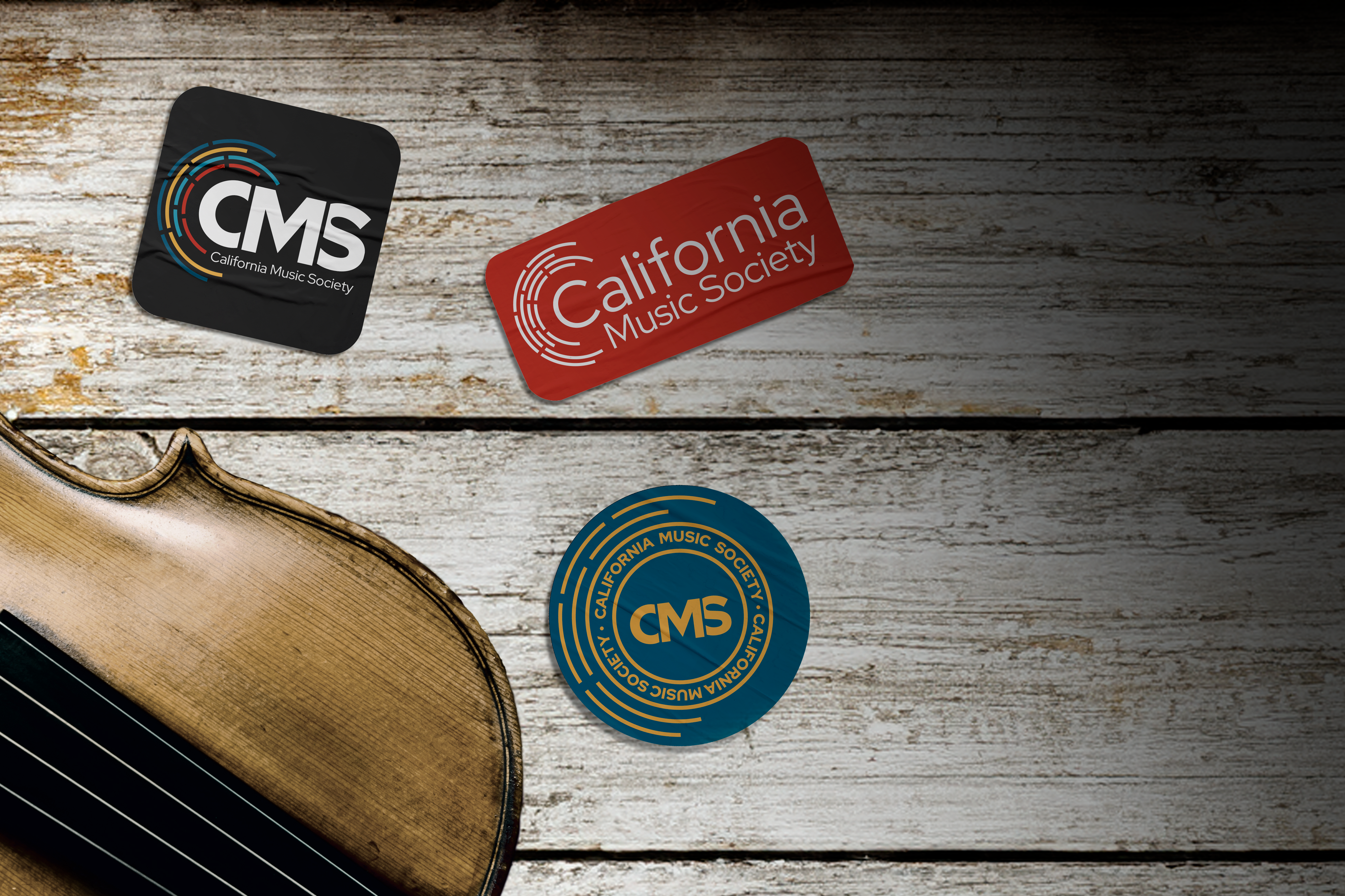
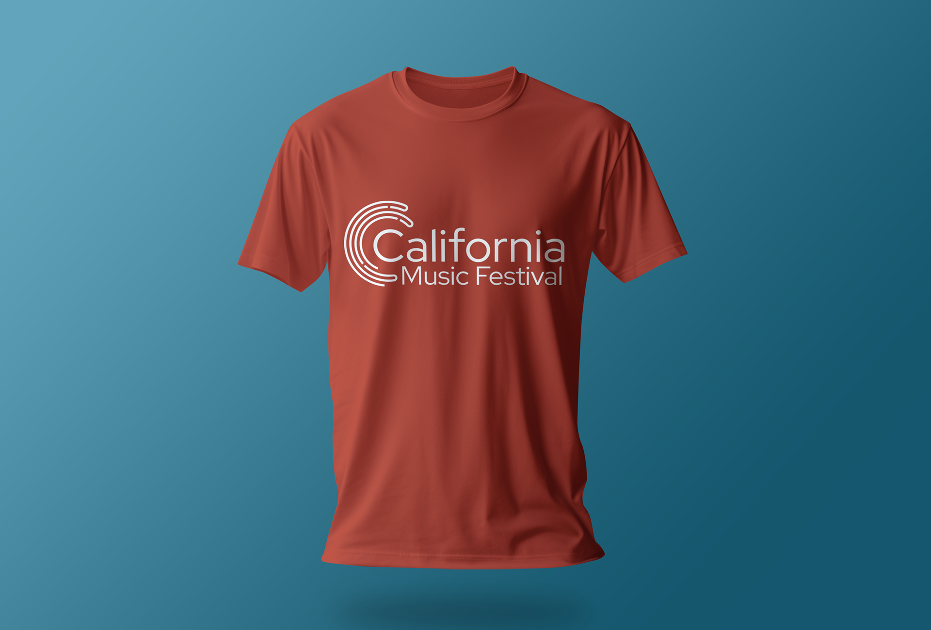
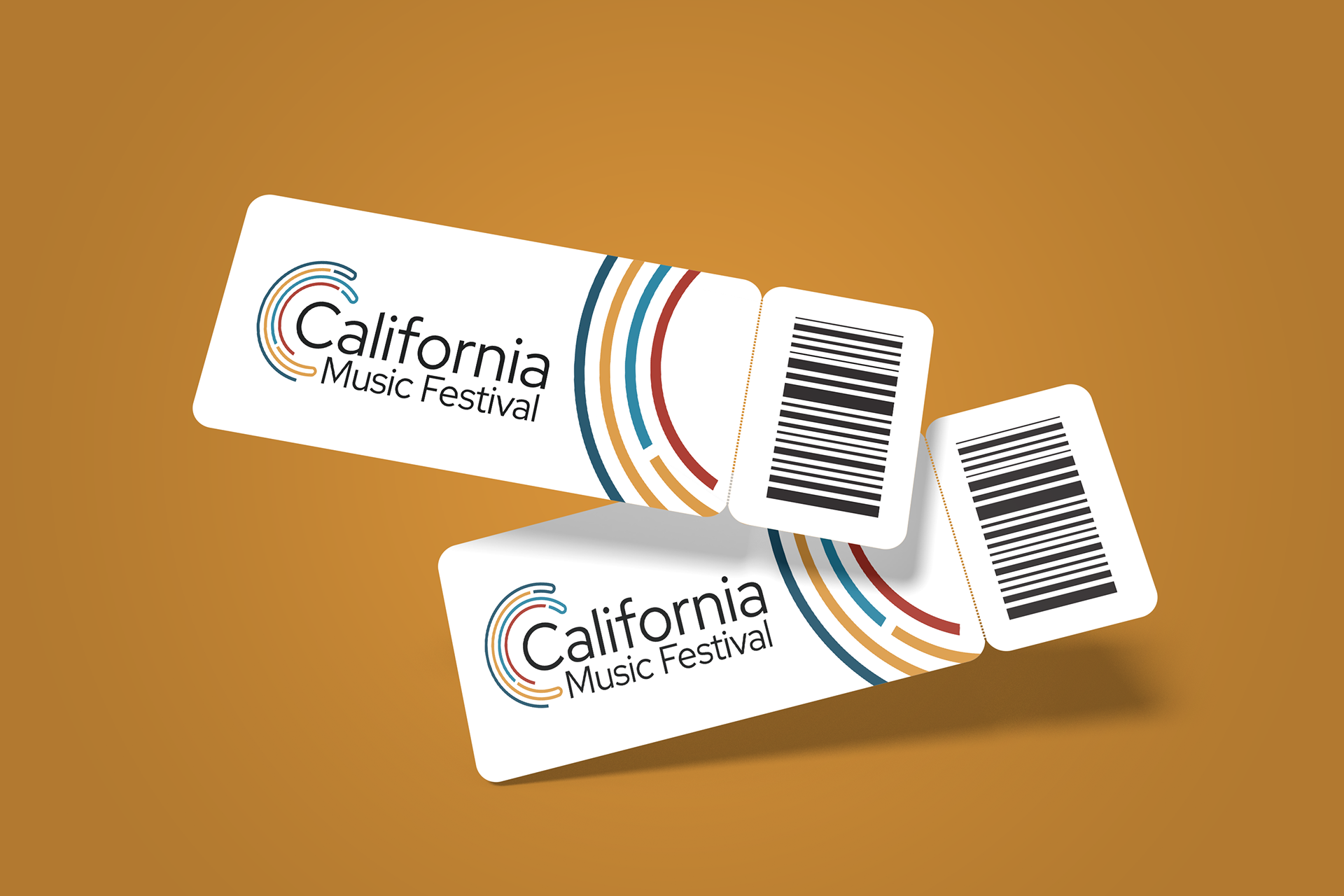
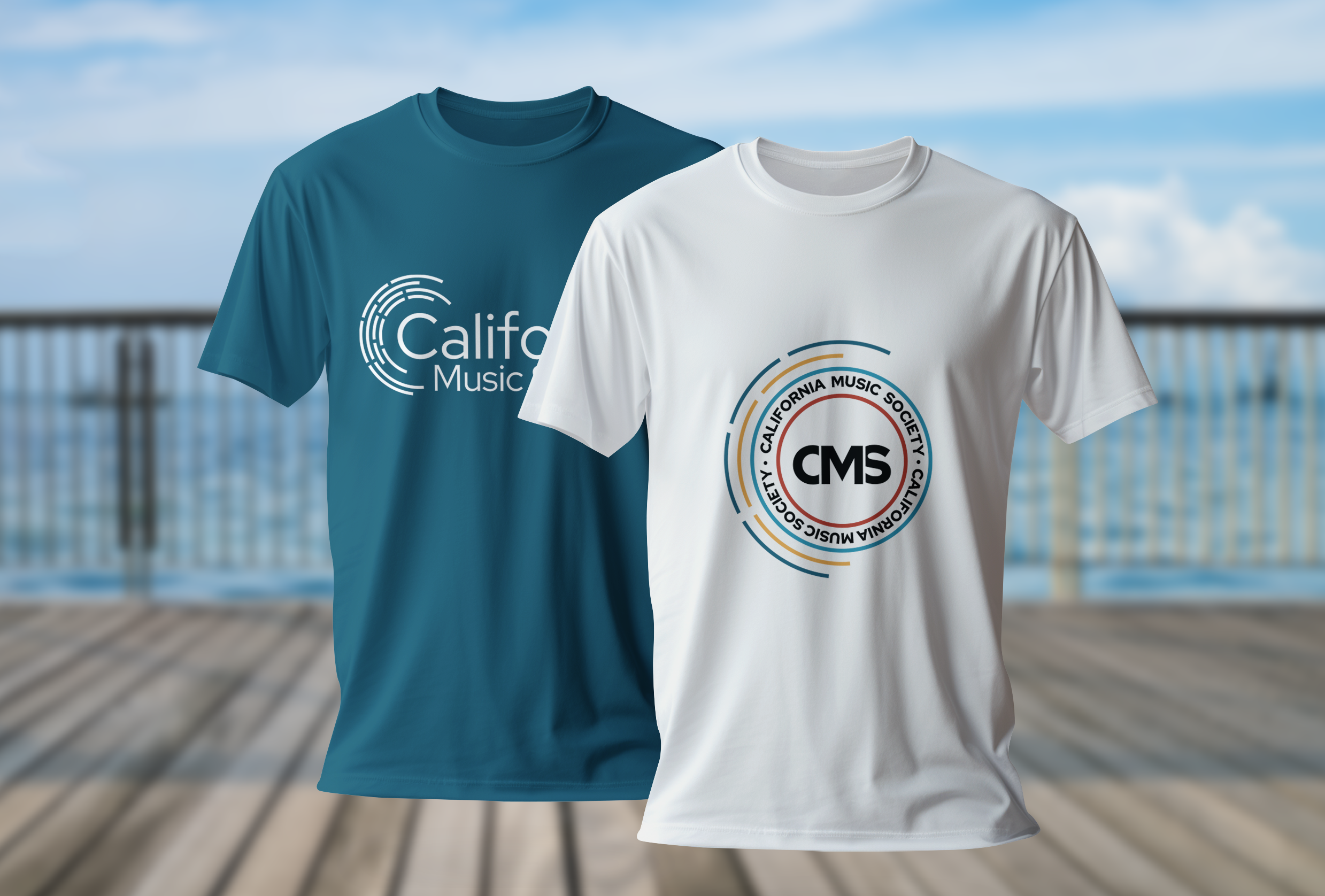
I created a few mockups to show the client what it would look like on merchandise, displays, and business cards.
Social Media Images
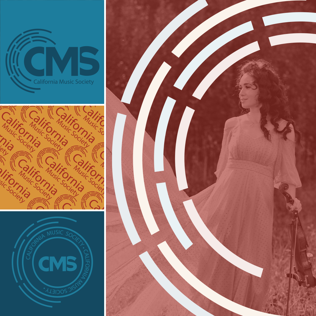
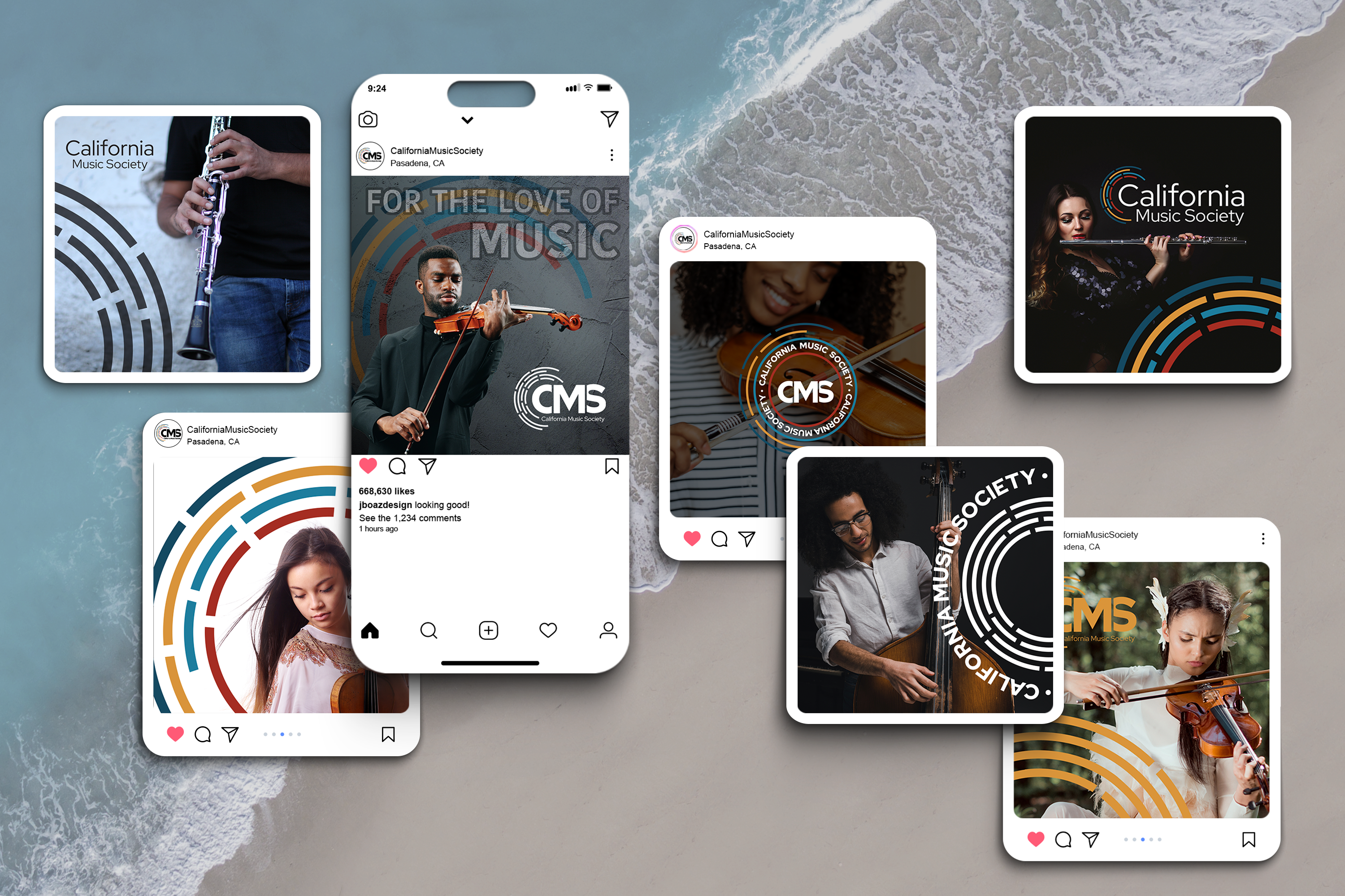
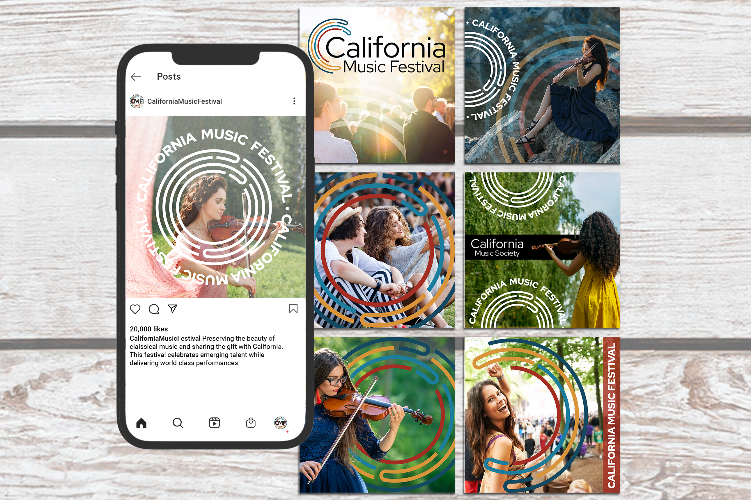
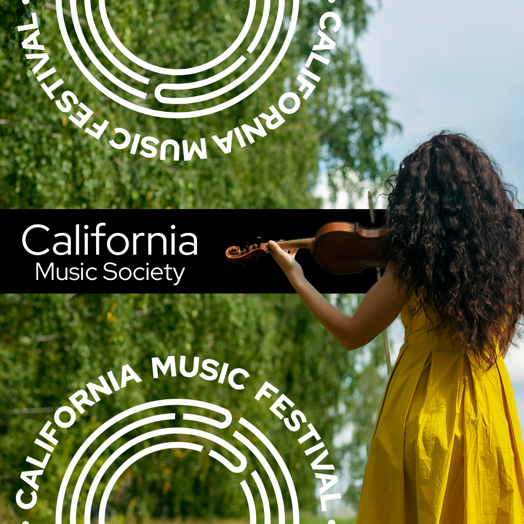
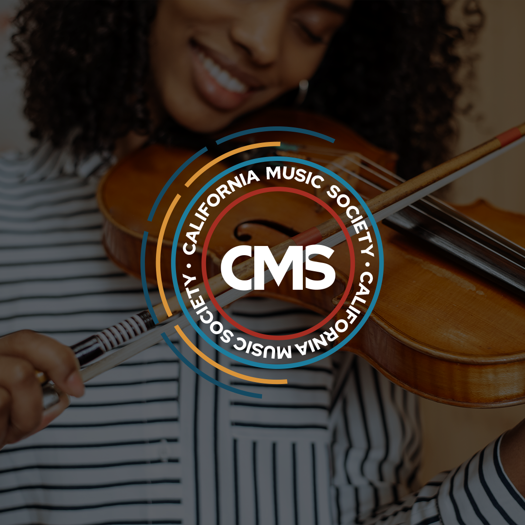
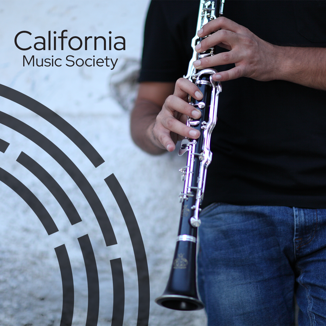
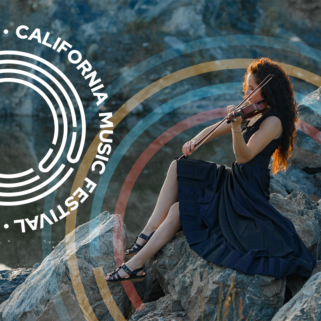
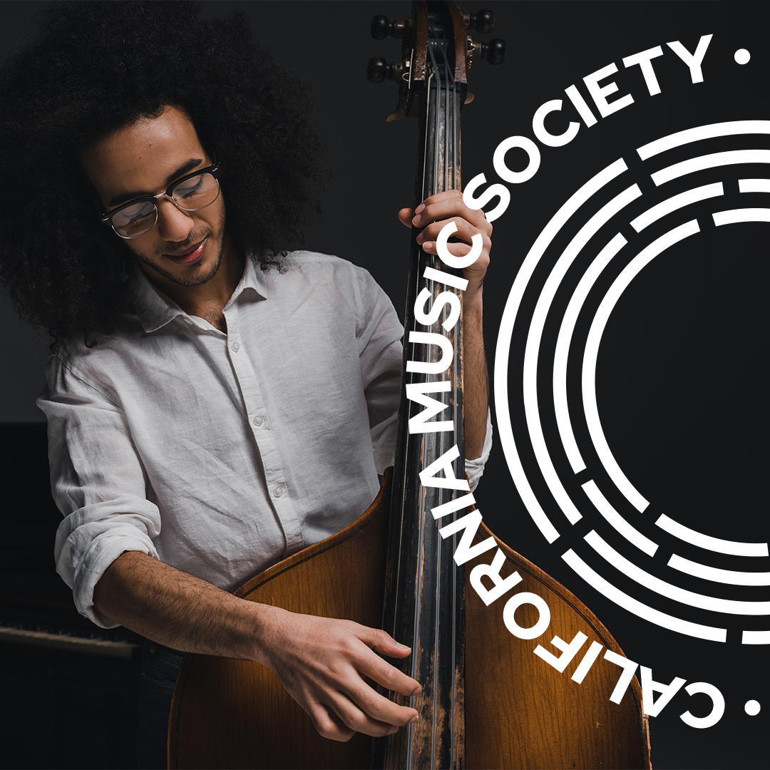
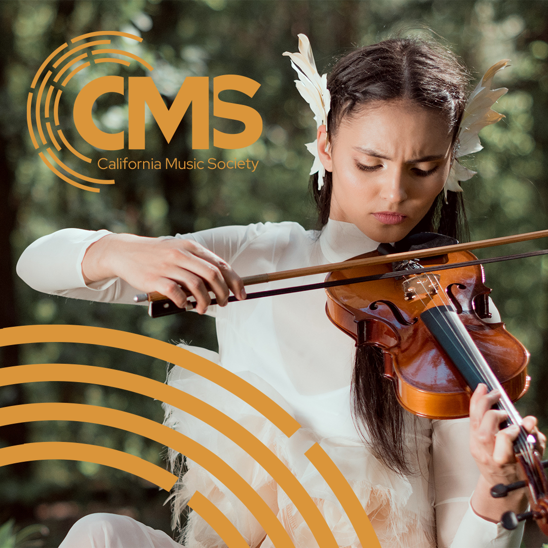
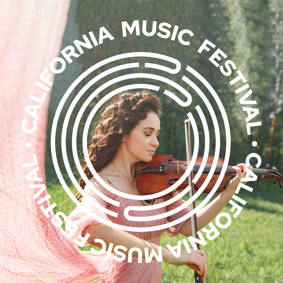
I created some branded images to be used for social media posts.


